Project Summary
ComicHub is a platform that provides businesses with an all-in-one solution to run their comic shops from a POS system that can help manage inventory and ordering to a companion app that customers can use to order books, ComicHub aims to streamline the process of purchasing comics and other books for collectors.
Key Challenges » Redefining the experience of using the ComicHub app; Understanding the capabilities of ComicHub within the comic book store ecosystem; Aligning user goals with business goals
Role » Product Designer(UX/UI)
Methods » User Interviews, Persona Development, User Flow Mapping, Hi-Fi Prototyping

Problem Statement
Customers' choices are influenced by artists, writers, cover art, and favorite characters. Discovery needs to be visual and browsable, not just search-driven.
Insight #2
Covers, logos, and followed creators are the biggest drivers of comic choices. Given the 5 to 15 minute average session, the experience needed to surface books visually rather than rely on search alone.
Insight #3
Across all three interviews, disorganization was the most cited frustration. Too many taps, unclear navigation, and results that align with expectations.
Problem #1
The search function is buried behind 2 screens, with 2 additional taps required just to see results. For customers browsing casually, that friction was enough to abandon the session entirely.
“Maybe 5 to 10 minutes at most. Not a very long time… but I would say probably about like 5 minutes I'd go on and be like, Oh, I want this thing.”
— ComicHub User
Solution
Products would be surfaced directly on the Home screen, organized to reflect browsing patterns customers use in store. The path to discovery would go from multiple taps to a single scroll.
Before

After

Problem #2
The search function is buried behind 2 screens, with 2 additional taps required just to see results. For customers browsing casually, that friction was enough to abandon the session entirely.
Solution
Search would be pinned to the top bar and reachable in one tap from anywhere in the app. Results would be organized into 16 item pages with filter chips that show what is active and clear in a single tap. Each product card would include a quick add button so customers could add to their Pull List without losing their place.
After

Problem #3
The app suffers from a number of performance issues including random crashes and repeated results caused by auto loading. These issues were compounded for older customers who found the app hard to navigate.
"I think it just needs better coding. It is just not well made. Not a very intuitive app." "He had added a lot of books through it and unfortunately the app did not speak to our system, so we did not have those books for him."
— Store Employee
Finding
Backend failures with the app are a platform and engineering constraint outside the scope of the redesign. Surfacing this finding alongside the visual redesign and UX recommendations could help re-establish customer trust and improve sales performance for the store.
Opportunity Area
ComicHub functions as the primary brand throughout the app, making the app feel like a generic platform rather than a partnership. The Contact Us feature for example connects customers directly to the ComicHub team rather than the comic shop itself.
DESIGNER'S NOTE
Introducing Anyone Comics' branding alongside ComicHub would reframe the app as a store centered experience. This would create space for personalization by promoting in store events, highlighting inventory, and making the shop the primary point of contact.
The iteration process moved from sketch to lo-fi to mockup, with each pass focused on reducing the number of taps needed to complete core flows. Search, browse, and checkout were the primary flows driving every design decision.


Key decisions across iterations include flattening the IA to remove redundant screens, moving search to the top level nav, introducing horizontal carousels for new releases and staff picks, and restructuring the bottom nav around key functions that users would need.
The redesigned Home screen surfaces products immediately on landing. A top level search bar, event promotions, new releases carousel, and last call for pre-orders give customers everything they need without a single extra tap.
Search results are organized into 16 item pages with active filter chips, a grid and list view toggle, and a quick add Pull List button on every product card. Customers can browse and build their list without losing their place.

Each product page surfaces writer, artist, publisher, cover art, price, and synopsis in a single view. A 'Recommended for You' section at the bottom supports continued discovery without requiring a new search.

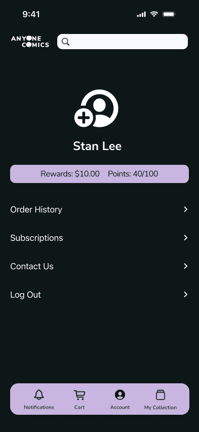
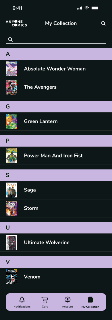
Order history, subscriptions, pre-orders, and collection tracking are brought together in one place. Customers get the operational visibility they need to manage books and orders reliably.