

Project Summary
Spectrum is a networking platform designed to help the neurodivergent community find and apply for opportunities that align with their strengths while fostering community connections with others on the spectrum. Built over 4 days as part of the General Assembly and Adobe Creative Jam, the project placed 27th out of approximately 100 teams with a score of 80 out of 100.
Key Challenges »Narrowing a broad brief about underrepresented creatives to a focused and defensible problem space; Designing an accessible mobile experience under significant time constraints; Balancing the needs of neurodivergent users with the expectations of employers and the broader job market
Role » UX/UI Designer
Methods » Secondary Research, Competitive Analysis, Sketching, Hi-Fi Prototyping


Existing platforms were not built with accessibility in mind for neurodivergent users. Without accommodations built into the experience, users are left to navigate interfaces that were never designed for how they process information.
Transparency about neurodivergence helps candidates avoid unconscious bias upfront. Recruiters on the platform would be aware they are engaging with a neurodivergent community, creating a space where users never have to disclose or mask who they are enabling them to highlight their strengths.
The job search process can be isolating for anyone, but for neurodivergent users that isolation is magnified when the spaces available to them are built for and dominated by neurotypical users. Shared experiences and genuine connection create a space where showing up authentically is the default.

Neurodivergent users are more susceptible to cognitive overload than neurotypical users. A consistent layout with a clear visual hierarchy reduces the mental effort required to navigate the app, allowing users to focus on finding opportunities rather than figuring out how to use the platform
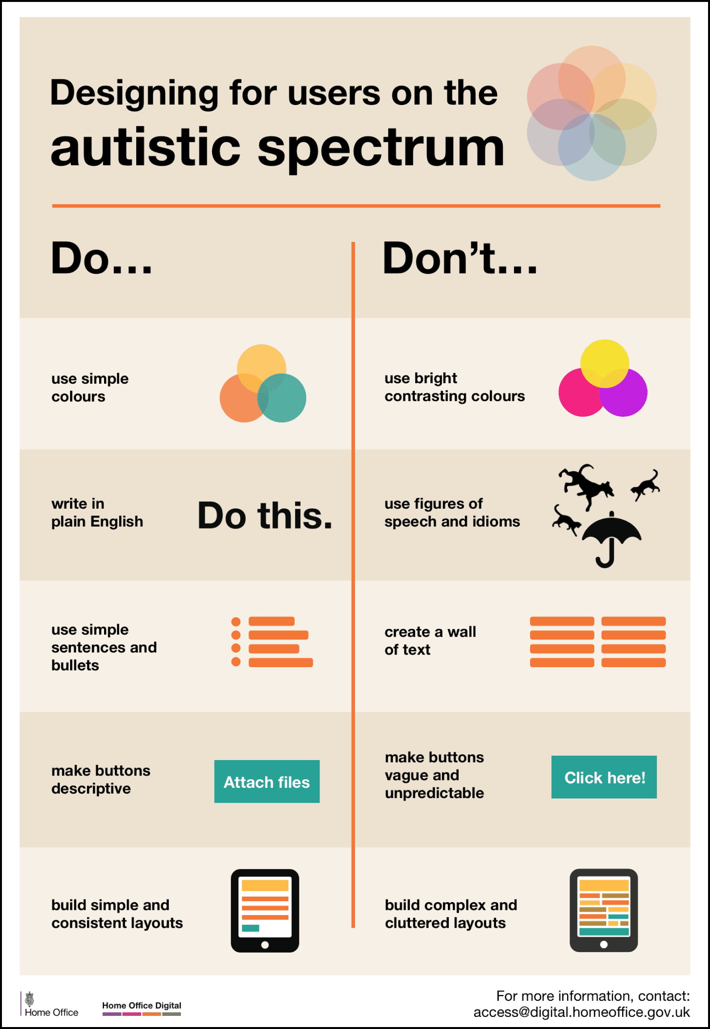
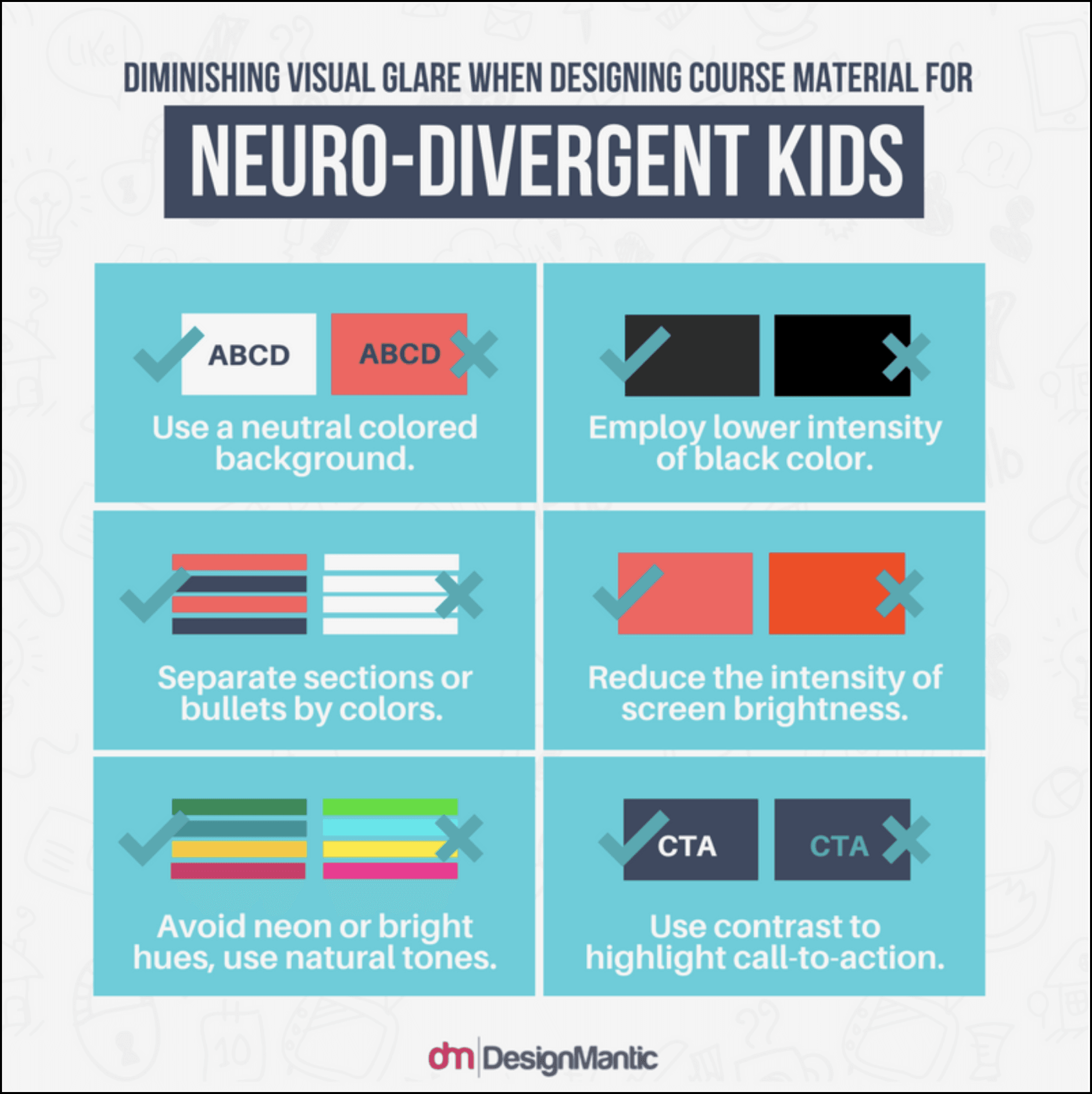
Color sensitivity and reading difficulties can present differently across the neurodivergent spectrum. Simple colors with strong contrast, clean fonts, and plain language create an experience that works across a range of needs rather than designing for one.
Ambiguity creates friction. Descriptive buttons, simple icons, and visual cues that directly correlate with their function give neurodivergent users the predictability they need to navigate confidently.
With 4 days to design and prototype, most major design decisions were made during the sketch phase before moving into Adobe XD.


Design Decisions in Practice

Color Switch
Neurodivergent users can experience heightened sensitivity to certain colors. While the interface was designed with a neurodivergent friendly palette, a color switch was built in to give users full control over their visual experience allowing for change to a black and white colored interface.

Limitation
Cognitive overload involves more than navigation and content. By limiting users to five job applications per day, it helps to prevent overwhelm and keeps the experience focused and manageable.

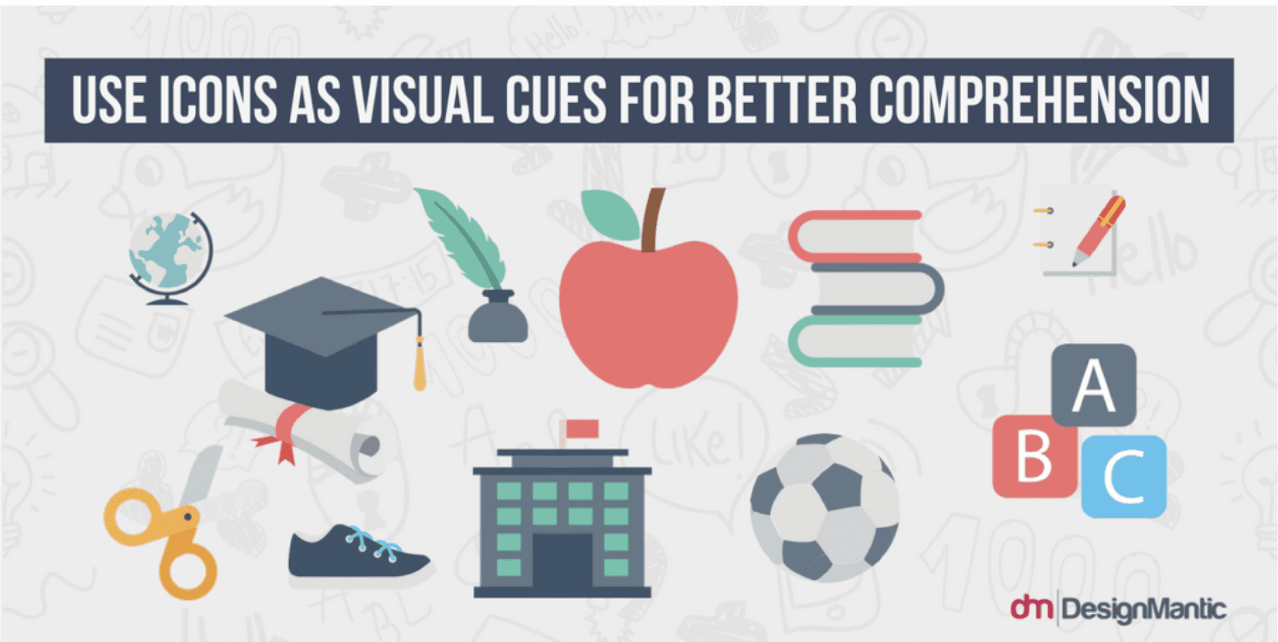
Simple Icons and Fonts
Throughout the design, text and icons are kept simple and directly correlate with what the user is looking for. Every element serves a clear and direct purpose.


© 2025 Randy Friday. Connect with me via Linkedin