
Pitstop
Racing to deliver marketing info booth visitors would normally skip.
I redesigned key parts of a financial dashboard to improve transaction visibility, simplify navigation, and help users understand their finances faster during everyday workflows.

Role
UX/UI Designer
Platform
Large Format Touchscreen
Overview
Delivering marketing info booth visitors would normally skip
Pit Stop is an interactive tabletop experience. Users select a car, place it on a track, and race around to reach the finish line avoiding other cars. By making choices, users move across different lanes to reach the goal receiving a detailed breakdown based on their choices.
The Impact
Developed as the centerpiece for a client's booth at the ADPD medical conference, evolving through a few iterations to fit project timing and resources.
The challenge was designing an interactive experience that reflected the client's marketing concept while delivering the information attendees came for.
A later update expanded the UI to support more choices in the user journey, along with revised content and a new final panel screen.
Problem
Getting healthcare professionals to touch a shared screen and stay
Storyboard

Challenge #1: Environment
This interactive piece was shown at an in-person conference during COVID. Outside of the normal COVID concerns, finding a way to draw people in and get them to interact was something that needed to be taken into consideration.
Challenge #2: Engagement
At medical conferences, attendees, typically healthcare professionals, seek current insights on diseases, conditions, and drugs amidst numerous vendor offerings. The challenge here was to deliver valuable and enjoyable content succinctly, facilitating quick information retrieval and seamless navigation.

Sitemap


Design Decisions
Turning six screens into a race track that guides visitors to content
Equipment Specs
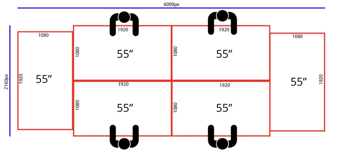
Pit Stop consisted of 6 screens that connected together to play a attract loop in the back of race cars going around a track. The two end screens housed additional medical information while the four screens in the center served as individual stations for four users.
#1) Overlay Window
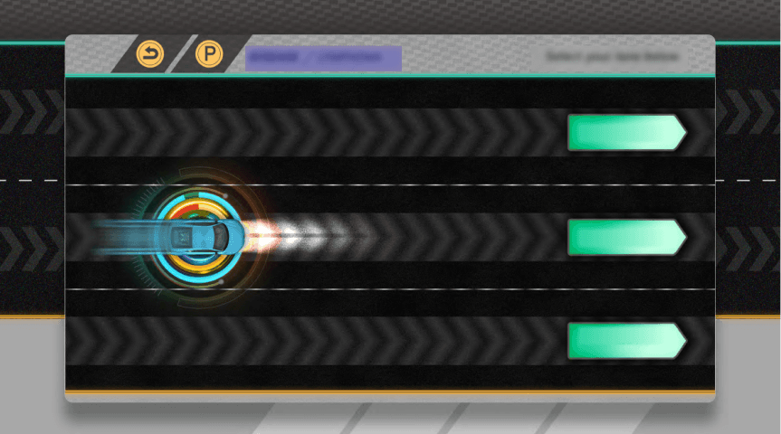
The proposed orientation for the overlay window was changed to horizontal versus vertical. By doing this, more of the screen real estate is utilized allowing for more interface elements to be used.

#2) Marketing Concept Integration
During team meetings, there was a discussion of highways and exits in relation to the road that the car was traveling down. This was reflected in the wireframe with splitting roads and road signs. This was changed with the increase in fidelity. The lanes were kept and the road was changed to a track to align more with a race track.
#3) Breadcrumbs and ‘Reverse’ Button
Breadcrumbs were introduced along with a ‘Reverse’ button to support it. Due to the number of choices and paths that a user could take, these were added to give more control of the experience to the user and prevent the need to restart the experience to explore different paths.
#4) 3D printed Car to Onscreen Car Graphic
The original idea at the start of this project was to have a 3D-printed car be used to start the interaction. A 3D race car would be present at each station and users would place the car at an indicated point on the screen. Due to timing, there was a pivot from this to a drag and drop action that would allow users to pick from four different cars that would be present on the screen in the bottom right corner of the overlay window.
Final Design Choices
Building a race track journey that could grow with the content
Storyboard

Original Design



Post-Handoff Update
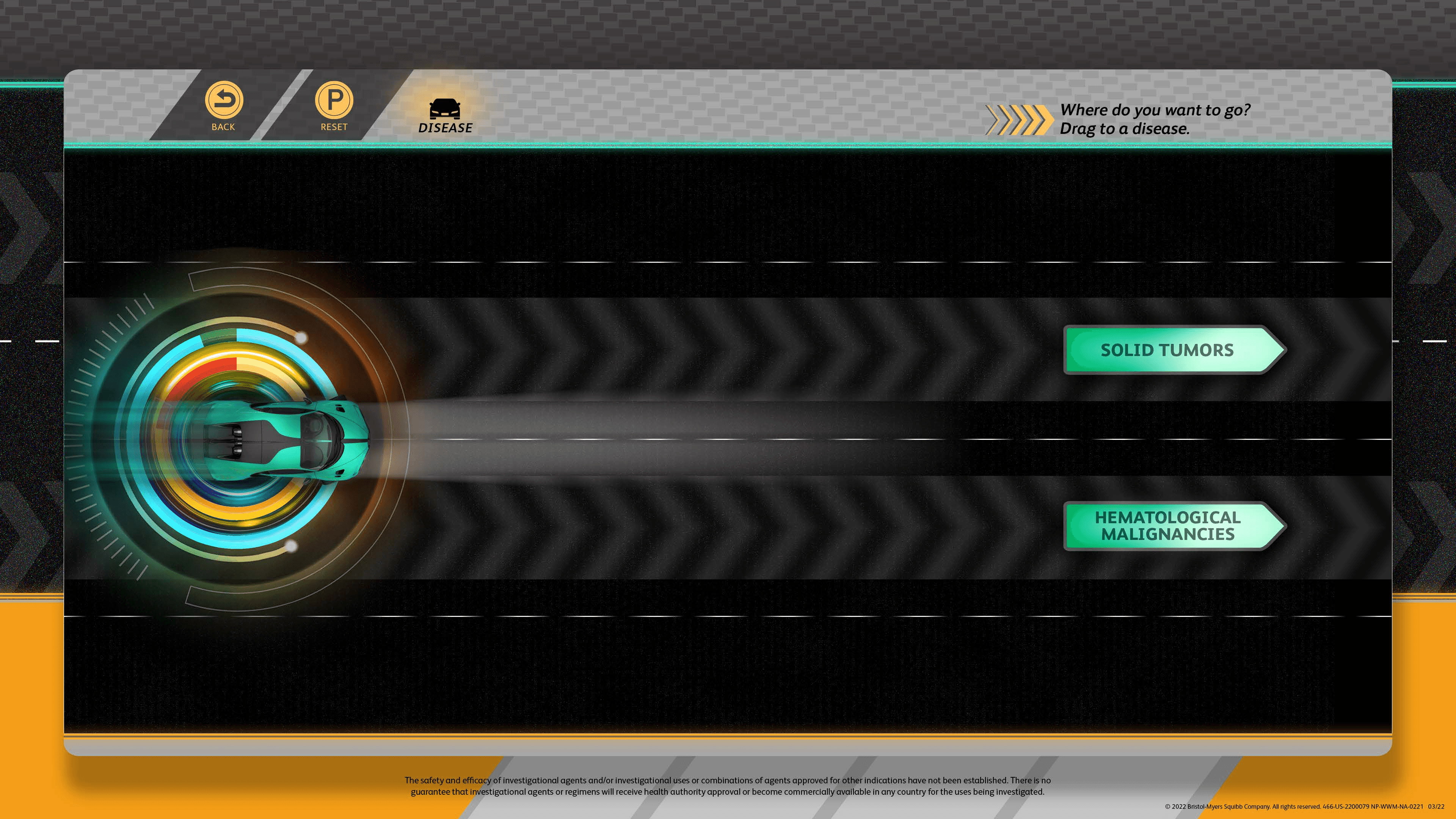
A few months after handing off the final deliverables, the client asked us to make some updates to the UI for the next Congress Pitstop would be on display. This requested change revolved around an update in the information being provided which influenced the number of choice possibilities available to a user. The previous solution for the UI was not designed to accommodate this need, so the team needed to make updates to the Art and overall user experience.
#1: Race car choices influence user journey
The race car choice at the beginning of the interaction was changed so that each represented a different choice. Depending on which car a user picked, there would be a different set of choices to make.
#2: UI updated to integrate more choices and fewer steps
The client requested a small update to the experience that involved more choices. The maximum choices a user could make were increased to eight for certain paths. To solve this, tabs were introduced on the final screen and the interaction was reduced to three steps/taps.



Lessons
Project Status
The project was successfully completed and handed off to the client for both v1 and v2. There are a number of UI changes suggested to streamline the interactive experience that weren’t incorporated and some that in hindsight I wish to update for a future version.
Some changes I wish to make include:
Correcting the function of the breadcrumbs to show where someone is in the interactive experience. Currently, it communicates that the user is always one step behind in the overall experience.
Utilizing the car selection process at the beginning to start the interaction, each car could be a separate category that when dragged onto the track would start the experience at what is currently the second step. This would allow the interaction to scale up for future iterations to be a lot easier.