
Otezla
Helping patients find the right information across three conditions, without the confusion.
I restructured Otezla's IA to unify three site structures under one URL and redesigned the SupportPlus enrollment form to reduce drop-off, adhering to strict regulatory compliance.

Role
Senior UX Designer
Context
Website rebrand
Methods
Site Audit
Wireframing
Sitemapping
IA restructuring
Team
Developer
Art Director(multiple)
Account
Market Researchers
Senior Leadership
Overview
Helping patients find the right information across three conditions
Otezla is a pharmaceutical brand that treats three different conditions, each with its own patient audience. This website provides information on how the medication works, what it treats, and the Important Safety Information (ISI) that caretakers, patients, and providers need to know before starting or continuing treatment.
The Impact
Restructured the information architecture to align three indication focused sections under one URL
Redesigned the SupportPlus enrollment form to reduce drop off and better serve prospective and current patients
Problem
How might we simplify navigation for Otezla's three indications?
How might we reduce drop-off for the SupportPlus form?
Hypothesis
If we create a consistent simplified navigation structure across the three sections of Otezla's website, then visitors will be able to find condition-specific information without confusion.
If we convert the SupportPlus form into a multi-step tracked form, then fewer visitors will abandon the form before completion.
Information Architecture
Auditing and Restructuring the Experience
The process started with a site audit, competitive research, and team alignment to ensure suggested changes addressed both the client and user needs. Three things needed to change. Navigation items needed to be regrouped to create more direct routes to information. The main navigation structure needed to work across all three indications. A clear line needed to be drawn between global navigation items and those specific to each condition.
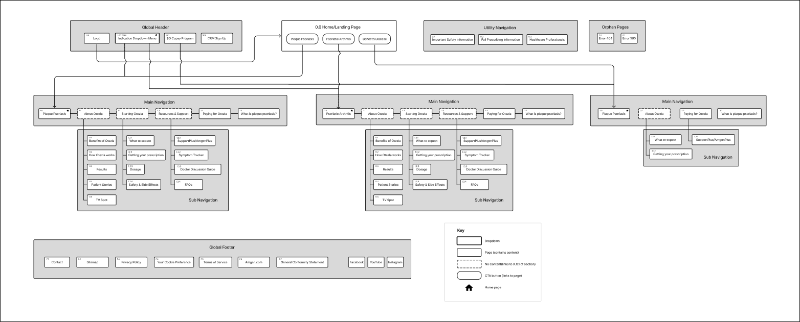
Revised Sitemap
Enrollment Form
Redesigning the Form Experience
Redesigning the SupportPlus enrollment flow meant solving for two different users using one form. I broke the initial experience up into sections to remove the long scroll, added a progress bar to keep users grounded, and created an early decision point that diverted prospective and current patients to the resources most relevant to their needs. The decision point itself was workshopped with the team to make it addressed both user groups before it was designed.
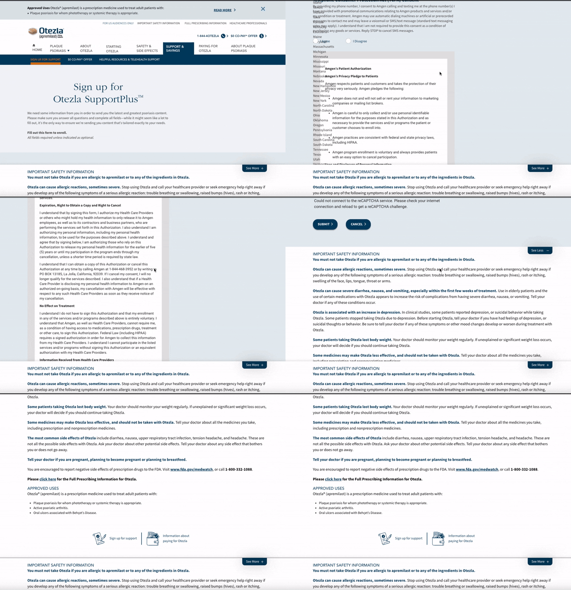
Original Form

Revised Form
Final Design
Three indications under one navigation structure, an enrollment flow that adapts to the patient, without the confusion or the drop-off.
My involvement ended after handing off wireframes for the entire site. The final shipped design reflects the core structural decisions from the redesign, with the IA and enrollment flow serving as the foundation.
See website wireframes

Key Takeaway
Advocacy is Part of the Job
This project taught me the importance of advocating for user centered design decisions. I often hold back my concerns about red flags during collaboration to maintain team harmony. I learned that staying silent does not protect the user experience or project outcomes. Speaking up for what serves users best, regardless of pushback or project constraints, is part of the job.