Project Goal
Redesign the product page for both mobile and desktop to better reflect the product information, i.e. functions, dimensions, to help users make a more informed decision when purchasing.
Competitive Research
I looked at the product page structure for two companies, Campaign and Burrow, that operate in the same space as Blvd Co. I utilized them in an A/B Test with my user. The main things I looked at were:
Visual Presentation
The use of copy to provide information to shoppers
Information hierarchy structure for the product pages
User Interview
During an interview, I was able to identify key points that would influence a consumer’s decision. Some of those points were:
Style and price influence the decision to buy a product.
Longevity is a factor that is considered when buying furniture.
Usability Test
To establish a basis for my design, I showed the user the state of the product page to gain applicable insights on what to focus on. The main points they touched on were:
Insight #1
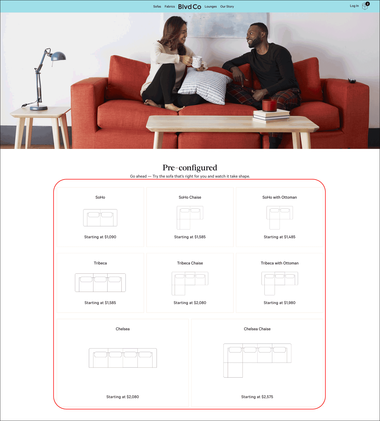
The 'Sofas' page on the website listed various items with different names. At first glance, they appear to be different couch models. However, the images depicted the formations created by the modular couch parts and not what the final product looked like.
Insight #2
Seeing actual people interacting with the product influences the decision to buy. It allows users to see the product in use when they are not able to do so themselves. While there were images depicting what the product looked like, there was a lack of actual human interaction on the page.
Insight #3
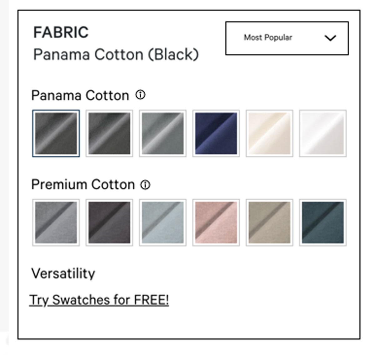
The names of the colors were hard to understand because of how they were labeled and categorized under the color menu. It was hard for the user to distinguish the look of the material based on the icon used to represent each color.
Before
After
Current Website Design
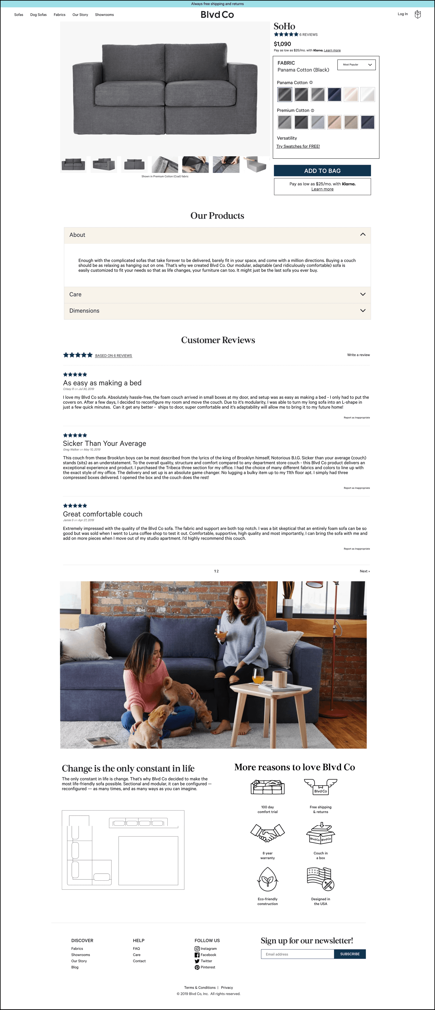
My Suggested Redesign
Project Overview
Blvd Co is an e-commerce company that specializes in selling modular couches. At the time of this project, consumers were able to buy single couch pieces or choose from a variety of configurations listed on the website. Since then, the company has shifted its focus to selling couches for pets rather than humans.
Role: UX/UI Designer
Tools: Sketch, Invision
Timeline: 3 weeks
Next Steps
My next focus for the project would be the color names and organization as that was a point of frustration that was touched on. I would touch base with the client and highlight some of the points that were brought to my attention.
Big Takeaway
For me, the biggest takeaway was the importance of establishing boundaries and expectations before starting on a project. Verifying what the client expects versus what my process and the deliverables to be expected saves time on both ends. When I started this project, expectations changed at random points that interfered with my ability to deliver value fully.


