Outcome
During my last day, I was at a standstill. My next steps revolved around understanding the use cases for the app in conjunction with the scooter. Questions I started to ask include:
• How would users interact with the app while operating the scooter?
• Where would the phone being used be placed on the scooter?
• Uses cases for the app while operating the scooter outside of desired functionality.
Next Steps
I would dive into the research side of things to ensure that usability and design are aligned before the final product is created and released.
Discover current users preferences compared to features on the app i.e. navigation, remote control of the vehicle through the app
Look into the real-world uses for operating the vehicle in conjunction with the scooter/bike.
Project Goal
Importing and redesigning screens for the Beyond companion app into Figma from Photoshop. My focus was on not only translating the design into Figma but filling in the missing pieces of users flows and redesigning components in an attempt to make them user-friendly.

Jumpstart
While on this project, the majority of my time was spent translating designs created by a graphic designer into Figma. The purpose was that it was easier to collaborate with the developer, who was coding the app as I migrated the designs in Figma for snippets of code that were provided.
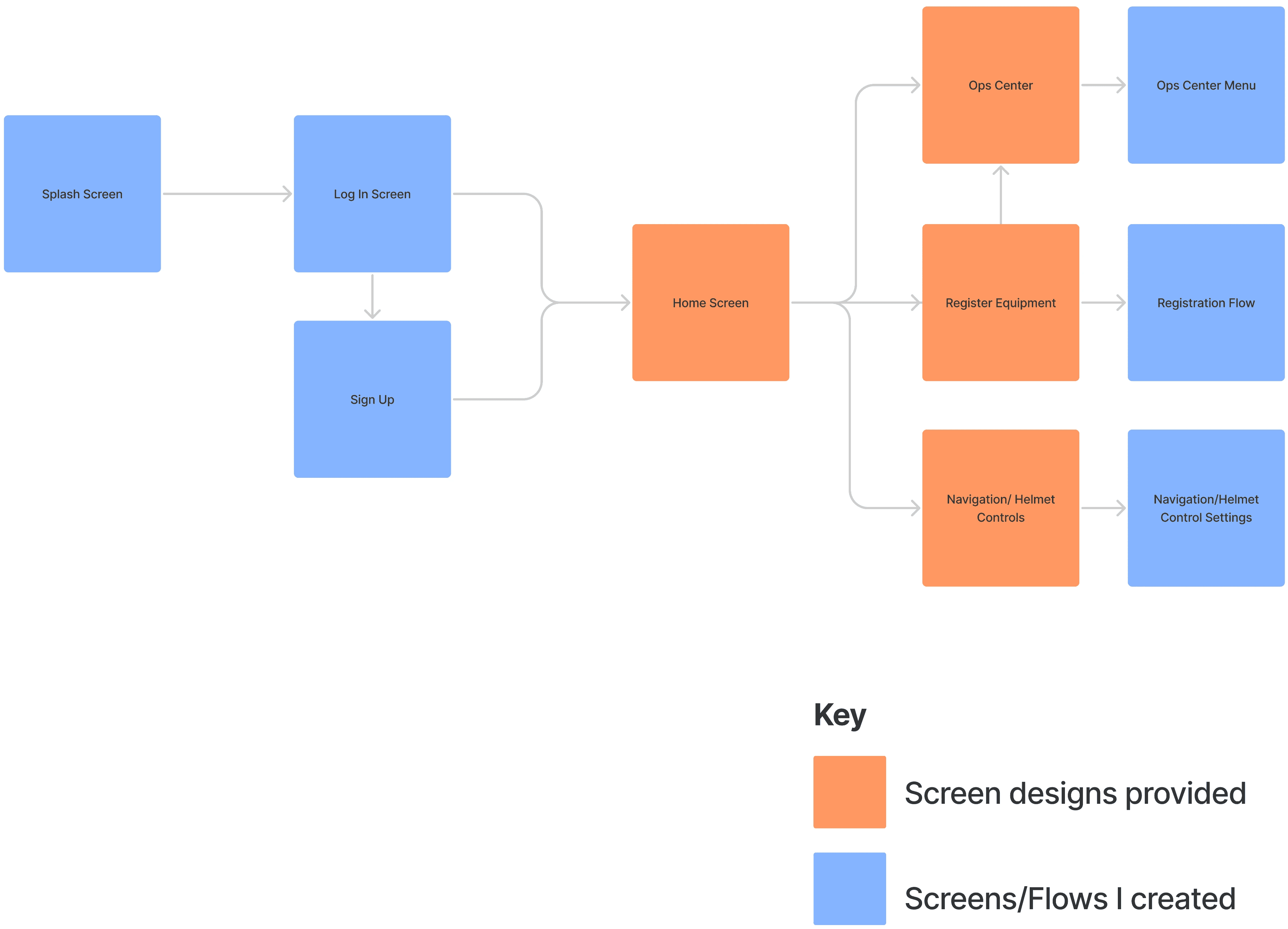
Creating Missing Flows
Several screens were not created in the PSD file I was provided. It fell on me to create the flows that connected them together.
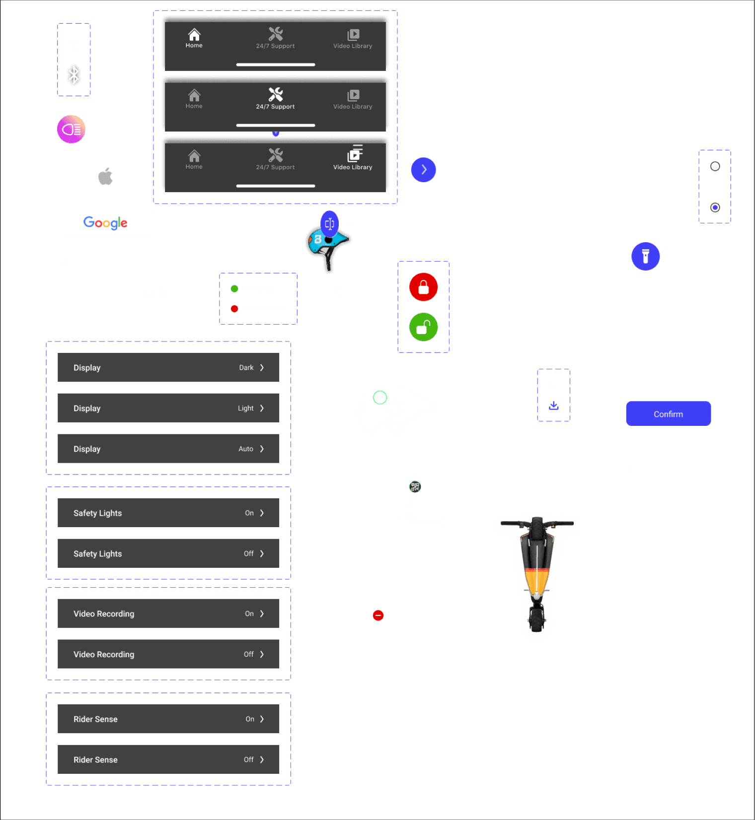
Starting a Component Library
I started a component library for hand-off to the developer. The library included default and active states for each button based on the action taken by the user and change states for things such as menus and settings.
The purpose of the app was to be a central resource of communication between the company (Beyond) and the consumer. It would provide access to the 24/7 support service provided by the company and videos recorded from the helmet dashcam.
Users were required to register their equipment, the scooter and helmet, to the app in order to operate them and utilize the benefits provided by the company.
The app also worked as a tracker and map for navigating. If the scooter/helmet was stolen or misplaced, users could use the app to find it once it was registered.
Obstacles
Tasks/Projects were given without much context. The company had a schedule for when they wanted to launch the app redesign but it wasn’t realistic. I was told what the app I was working on was SUPPOSED to do, but when asked about the specifics and practicality, there wasn’t a solid answer.
There was no established workflow in place between designer and developer. My pace was dictated by the CTO and ultimately it led to a lot of hold-ups on my end when it came to understanding the big picture.
Project Overview
Beyond, formerly known as Brooklyness, is a startup company that provides a subscription-based service centered on e-scooters and bikes.
Their business model allows consumers to pay a monthly fee to lease a vehicle through the company. With the subscription, the company provides 24/7 maintenance service for any unexpected problems that arise while operating the vehicle. The company’s goal is to provide an easy, sustainable, and accessible option of transportation for commuters.
Role: Product Designer
Tools: Figma, Adobe Illustrator
Timeline: 2 weeks


