
Key Design Principles


Through user research, we identified the neurodivergent community as our target user group. The key insights we found when learning about their job search experience include:
• Existing platforms lack accessibility features tailored to neurodivergent needs
• Transparency about being neurodivergent helps candidates to avoid unconscious biases upfront
• Community connection is crucial when it comes to a job search for establishing a support network
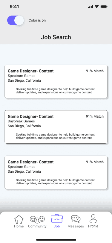
• Clear, structured interfaces that help to reduce cognitive load, prevent overwhelm, and improve usability


Next Steps
Test feasibility of concept » The best next step for our design would be to test it with our target user group. Time was a major factor in completing this challenge, so we relied on secondary research from sources that provided high-level information. Getting the perspective of those who can tell us where our concept hits the mark and where we might have gone astray will be vital to any updates we make. By doing this, we can take our idea from concept to reality.
Project takeaway
The biggest takeaway from this project is the importance of accessibility in design » Many of the findings related to user problems for the neurodiverse overlapped with user problems for the neurotypical, i.e. cognitive overload. What separated them was the intensity with which each user experiences it. This project also brought to light the need to remove biases from decisions and redirect focus to a person's abilities in spite of any challenges they may face.
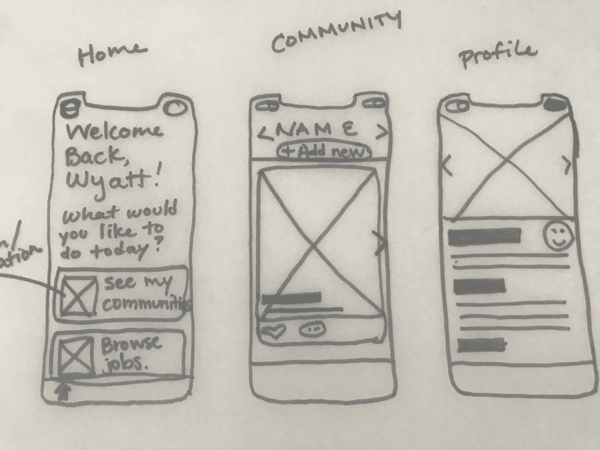
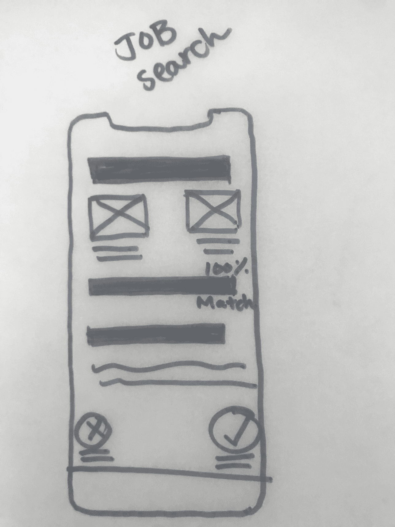
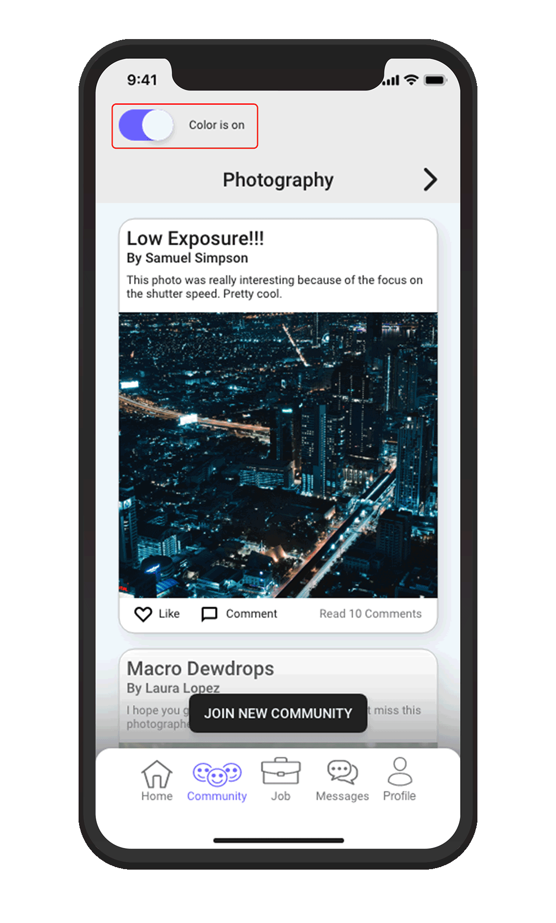
Final Design


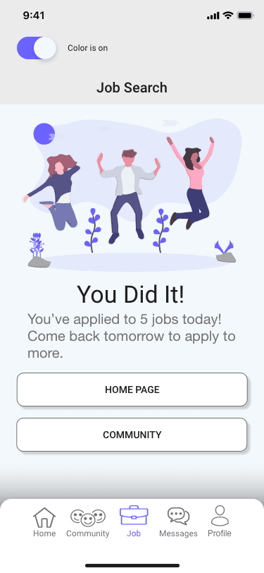
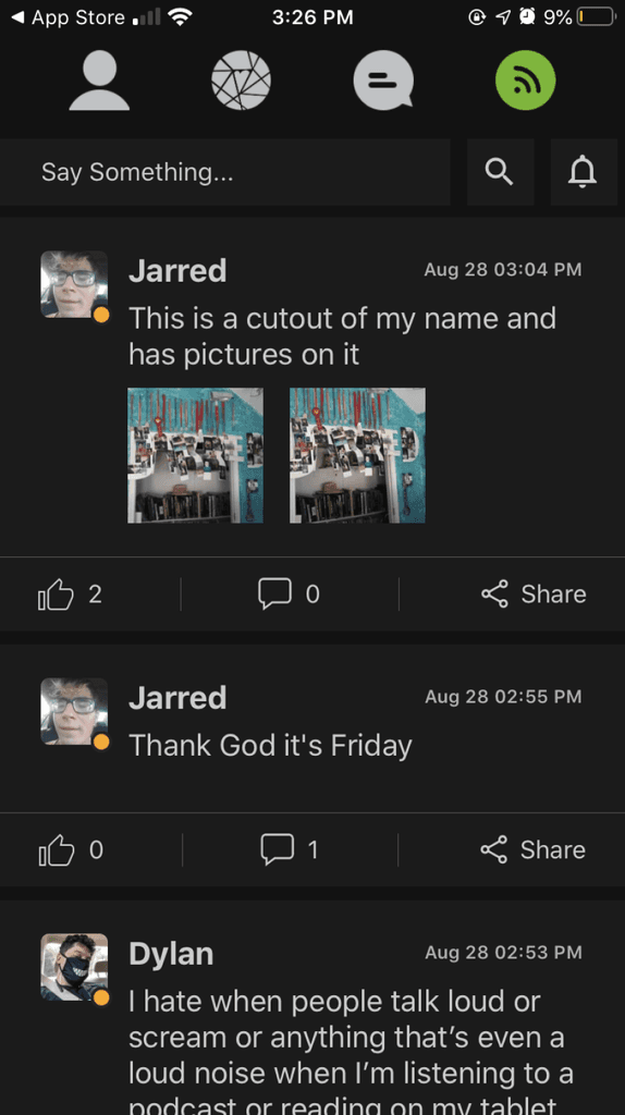
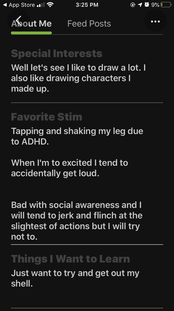
• Designed a community platform experience that focused on the lived experiences of the neurodivergent to highlight their strengths and promote empathy from others
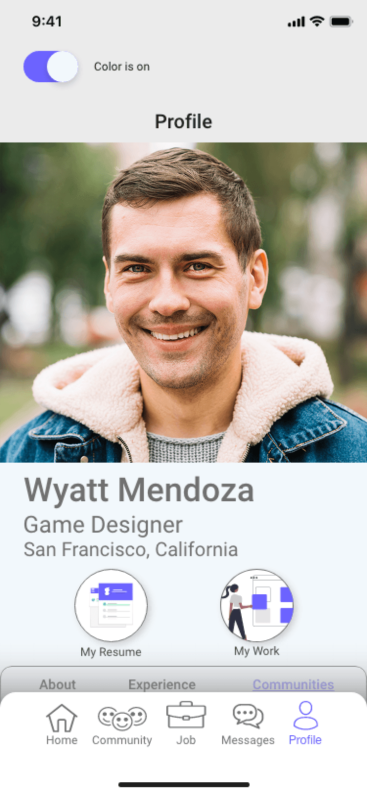
• Applied evidence-based accessibility principles to cater the experience to our target user base
• Designed an inclusive space that fosters belonging rather than masking or adaptation
Project Summary
