User flow for Prototyp

User flow for Prototyp

User flow for Prototyp

The user base is composed of individuals who use Adobe Acrobat daily to complete their work. To reduce the amount of
onboarding time required to learn a new program, I looked at several Adobe programs(Photoshop, Illustrator, Adobe Acrobat) for
IA and structural insight when presenting information.

Grammarly was another application I looked at in regard to IA and function because of how similar it is to Prototyp.

The user base is composed of individuals who use Adobe Acrobat daily to complete their work. To reduce the amount of onboarding time required to learn a new program, I looked at several Adobe programs (Photoshop, Illustrator, Adobe Acrobat) for IA and structural insight when presenting information.

Grammarly was another application I looked at in regard to IA and function because of how similar it is to Prototyp.

Directions for functionality

  • Large main focus for content

  • Smaller half-size focus for document feedback and comments

  • Toolbar of common tools including a start process button

  • Chunk information by creating areas of focus for the document being reviewed

  • Find a way to highlight comments/suggestions currently being reviewed

  • Include export options

Framing the Challenge

Framing the Challenge

Exploration and Analysis

Exploration and Analysis

Questions for the user

  • What tools are currently used in the review process and for proofing documents for changes?

  • Would it be optimal to show multiple results?

  • What does the ideal output for application look like?

  • Does the AI algorithm scan the entire document or just what is different/not found in its database?

How might we design a user experience interface for an AI model that effectively reduces the time users spend manually searching through documents, enhancing efficiency and streamlining information retrieval processes?

How might we design a user experience interface for an AI model that effectively reduces the time users spend manually searching through documents, enhancing efficiency and streamlining information retrieval processes?

  • Pivot from an application that would allow editing within the Prototype to a companion program

  • Simplify the concept to only scan new documents and output matches from the internal database

Changes to the the design

Takeaways

Takeaways

  • Simplify the user journey and update flow to reflect the change from the initial application use

  • Decide on a visual style and aesthetic that is consistent with simple UI look of wireframes

  • Collaborating with others on a team of different specialties requires over communicating and asking questions repeatedly

  • As a designer, expectation management is important to avoid ideas from scaling too big especially during the initial design stage

  • Presenting research and evidence is key to getting everyone on board with the concepts being presented

Future Updates

Future Updates

Project Overview

Project Overview

Prototyp is an AI-based application that scans information from uploaded documents and matches them against a digital database eliminating the need for a manual search by users.

Please note that all mentions to and of clients by name have been removed or obscured to adhere to NDA restrictions.

Role: Product Designer

Tools: Figma, Miro

Timeline: 5 weeks

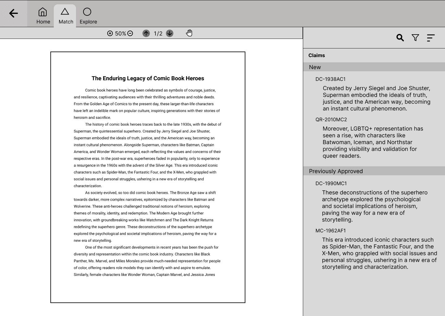
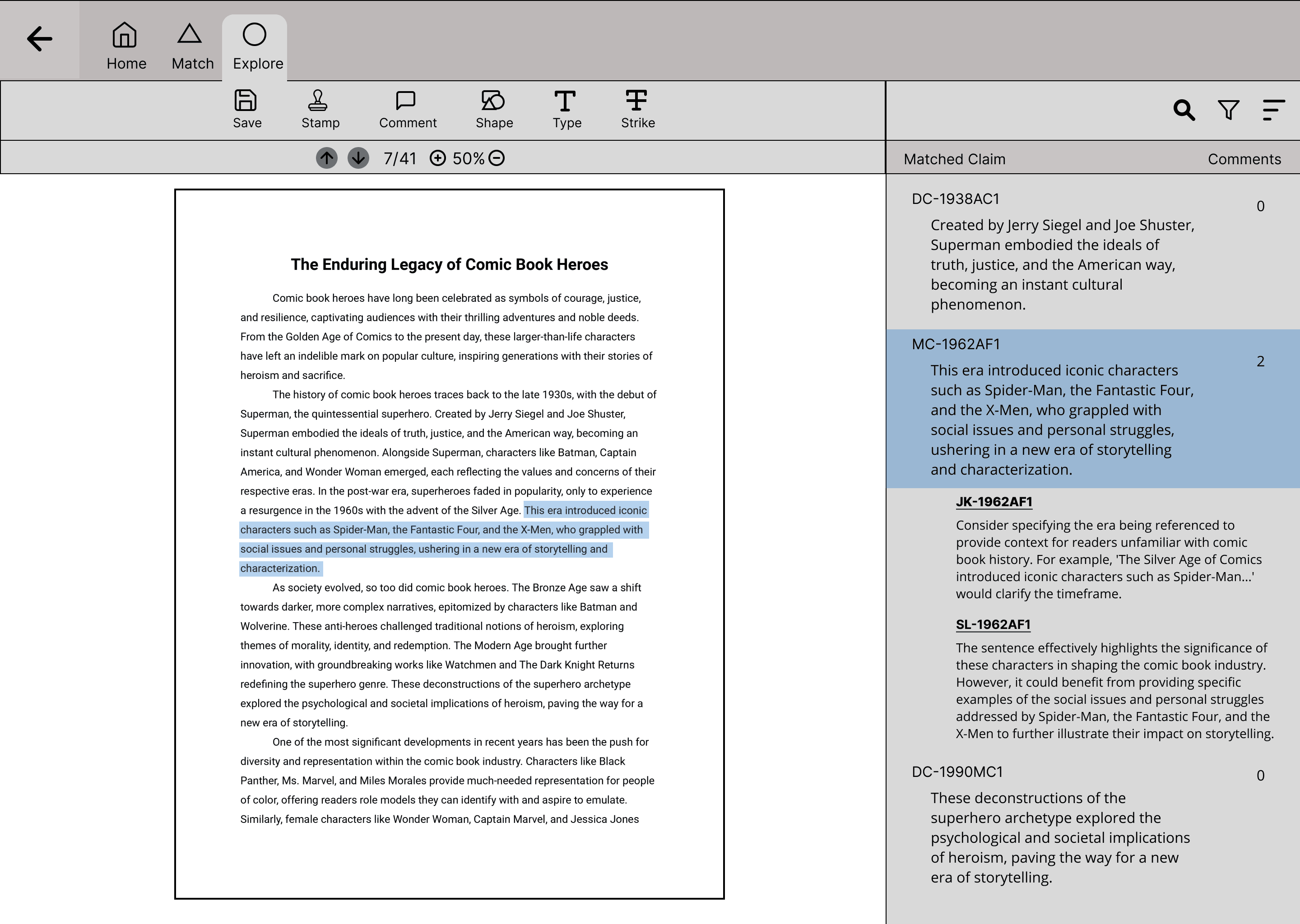
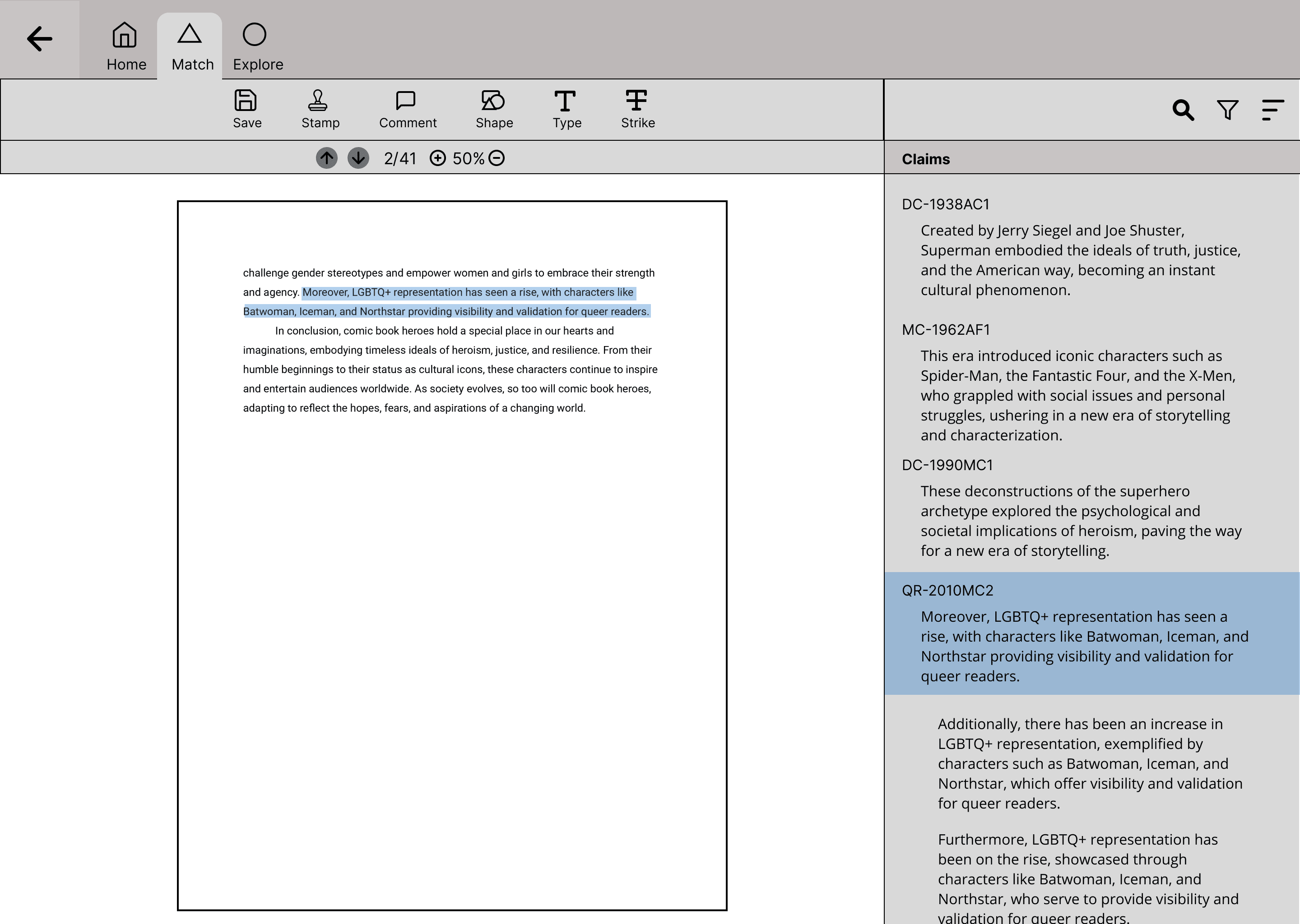
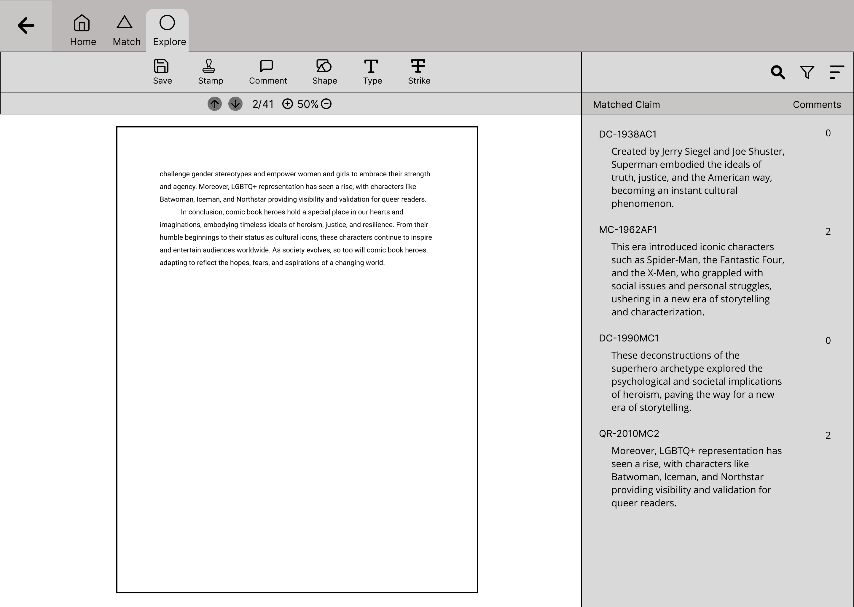
List of matched results the AI found that align with the internal database

Return back to file directory

Tabs to switch between different views and functions

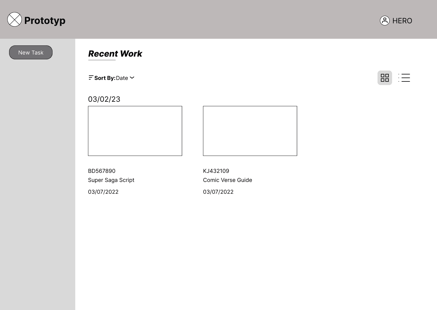
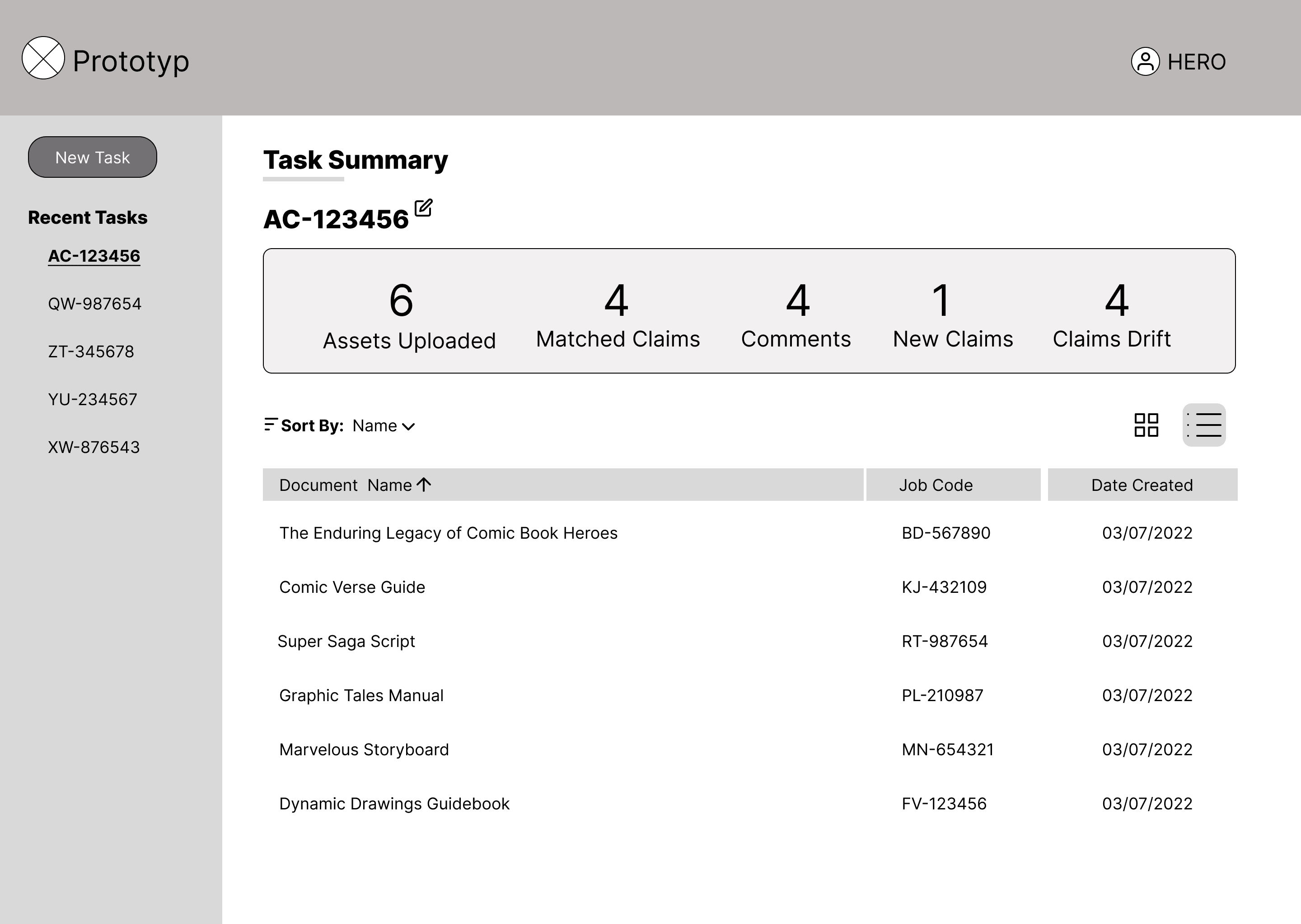
Individual account profile to allow management of files

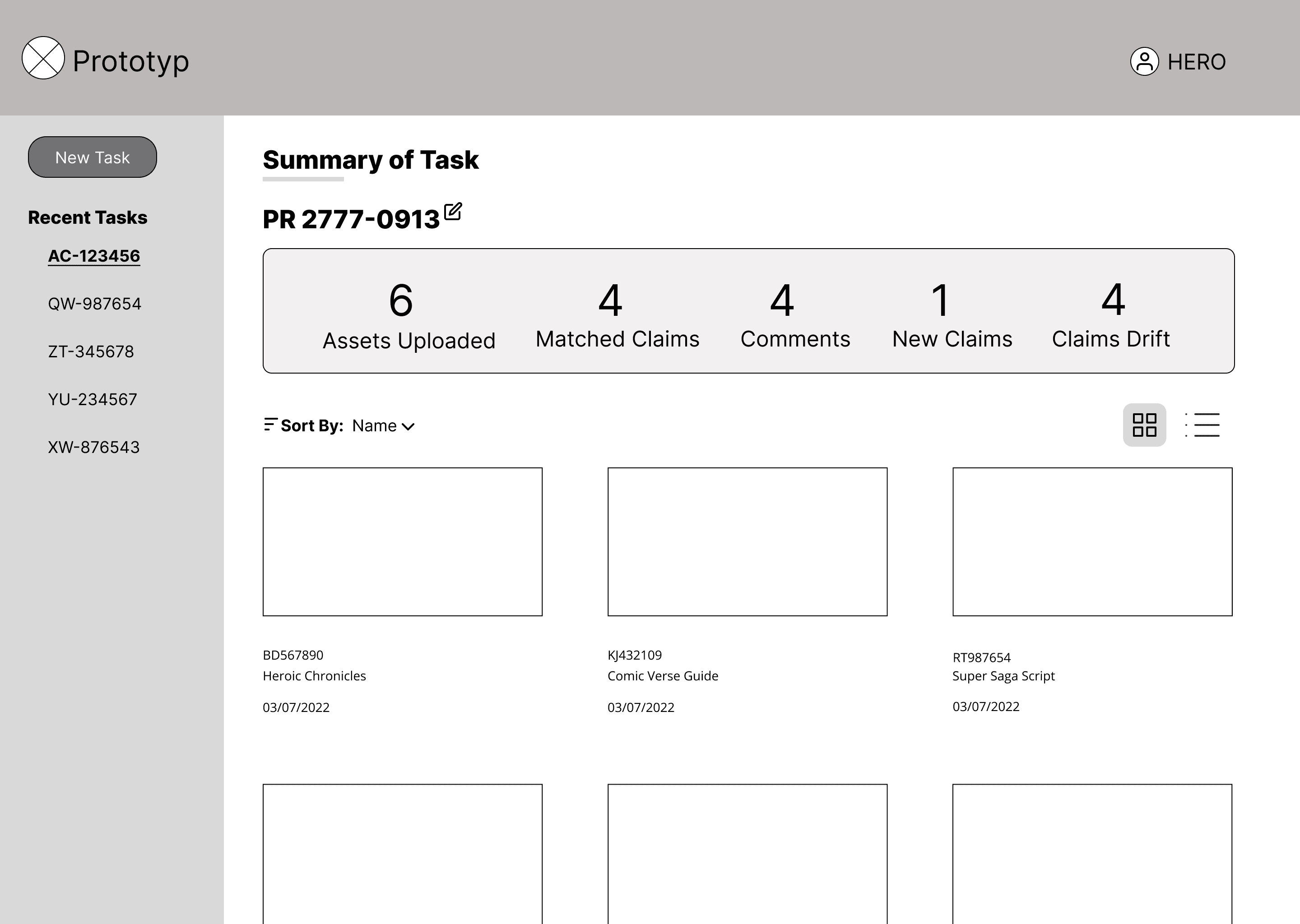
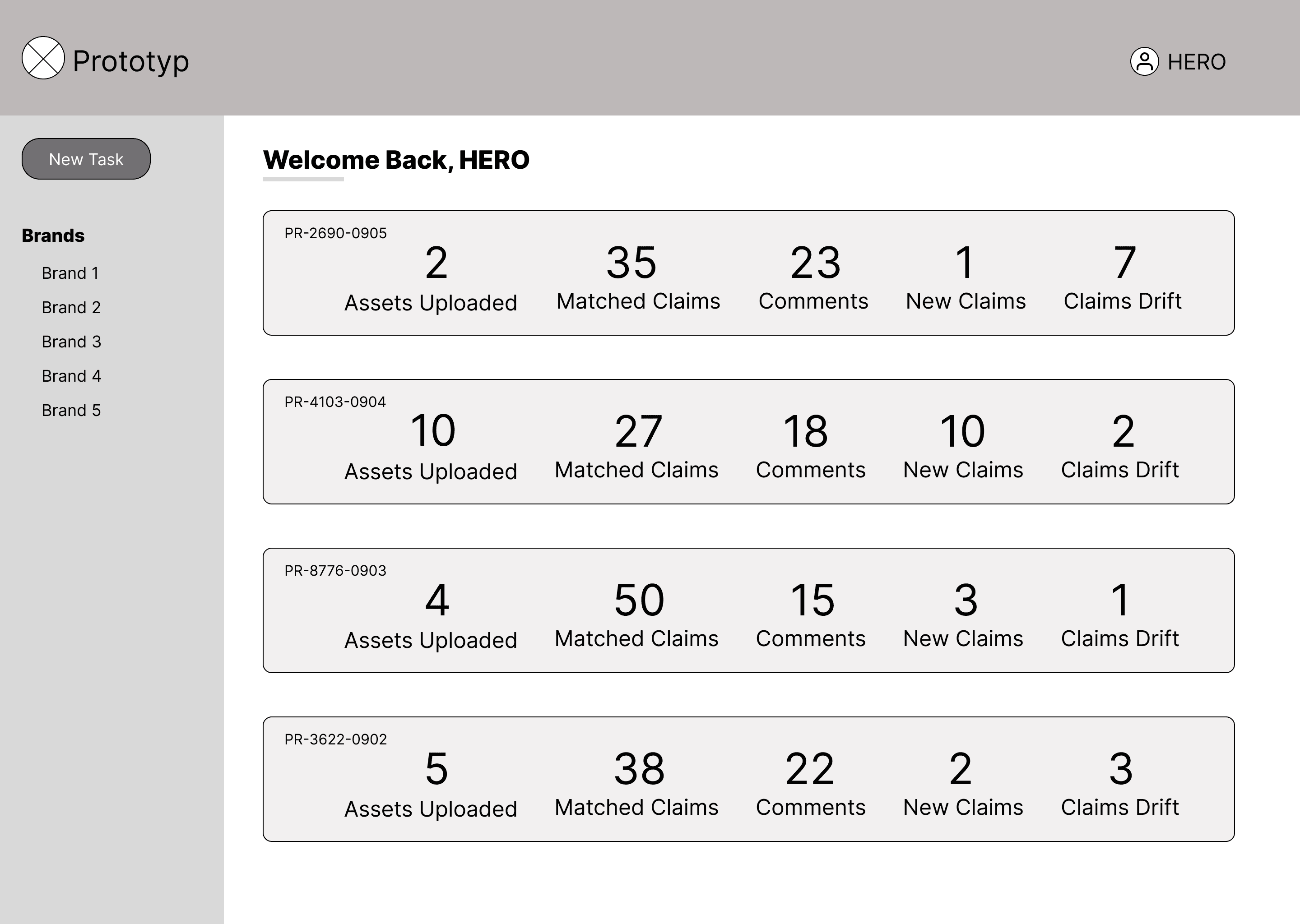
Button with noticeable visual treatment and placement for new document uploads

Large thumbnails with preview of document

Sort and view options

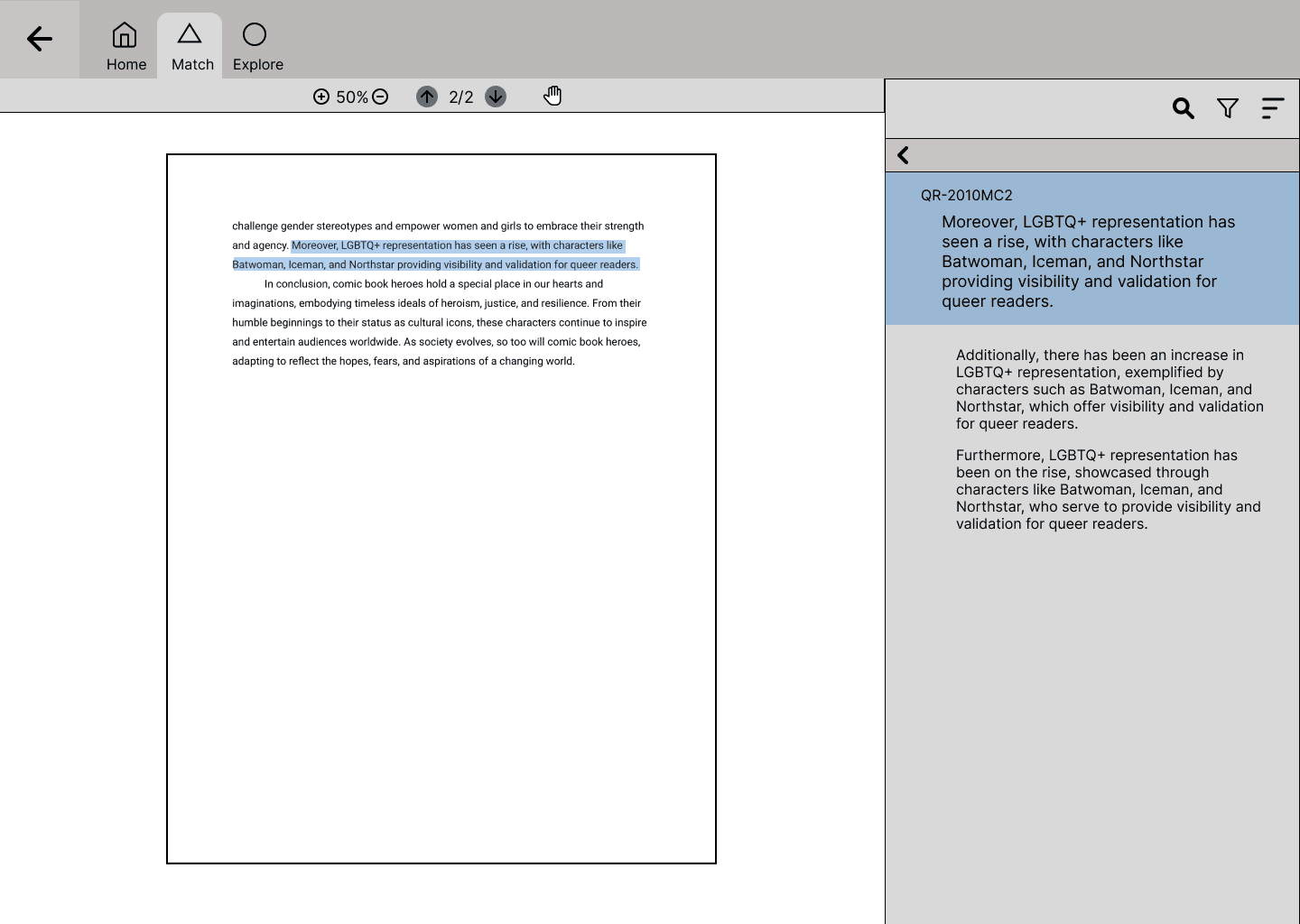
List of matches from the internal database so users can check for changes

Clicking a result also highlights the sentence on the document

Large thumbnails with preview of document

Sort and filter options

Button with noticeable visual treatment and placement for quick start for new document uploads

Individual account profile to allow personal file management

List of matched results the AI found that align with similar ones from the internal database

Return back to file directory

Tabs to switch between different views and functions

Clicking on a result also highlights the sentence on the document

List of matches from the internal database so users can simultaneously check for changes

User flow for Prototyp

User flow for Prototyp

The user base is composed of individuals who use Adobe Acrobat daily to complete their work. To reduce the amount of
onboarding time required to learn a new program, I looked at several Adobe programs(Photoshop, Illustrator, Adobe Acrobat) for
IA and structural insight when presenting information.

Grammarly was another application I looked at in regard to IA and function because of how similar it is to Prototyp.

Directions for functionality

  • Large main focus for content

  • Smaller half-size focus for document feedback and comments

  • Toolbar of common tools including a start process button

  • Chunk information by creating areas of focus for the document being reviewed

  • Find a way to highlight comments/suggestions currently being reviewed

  • Include export options

Framing the Challenge

Exploration and Analysis

Questions for the user

  • What tools are currently used in the review process and for proofing documents for changes?

  • Would it be optimal to show multiple results?

  • What does the ideal output for application look like?

  • Does the AI algorithm scan the entire document or just what is different/not found in its database?

How might we design a user experience interface for an AI model that effectively reduces the time users spend manually searching through documents, enhancing efficiency and streamlining information retrieval processes?

  • Pivot from an application that would allow editing within the Prototype to a companion program

  • Simplify the concept to only scan new documents and output matches from the internal database

Creating the Concept

Large thumbnails with document preview

Sort and filter options

Button with noticeable visual treatment and placement for quick start for new document uploads

Individual account profile to allow personal file management

List of matched results the AI found that align with similar ones from the internal database

Return back to file directory

Tabs to switch between different views and functions

List of matches from the internal database so users can simultaneously check for changes

Clicking on a result also highlights the sentence on the document

Takeaways

  • Simplify the user journey and update flow to reflect the change from the initial application use

  • Decide on a visual style and aesthetic that is consistent with simple UI look of wireframes

  • Collaborating with others on a team of different specialties requires over communicating and asking questions repeatedly

  • As a designer, expectation management is important to avoid ideas from scaling too big especially during the initial design stage

  • Presenting research and evidence is key to getting everyone on board with the concepts being presented

Future Updates

Project Overview

Prototyp is an AI-based application that scans information from uploaded documents and matches them against a digital database eliminating the need for a manual search by users.

Please note that all mentions to and of clients by name have been removed or obscured to adhere to NDA restrictions.

Role: Product Designer

Tools: Figma, Miro

Timeline: 5 weeks

Work

Resume

Work

Resume

User flow for Prototyp

User flow for Prototyp

The user base is composed of individuals who use Adobe Acrobat daily to complete their work. To reduce the amount of
onboarding time required to learn a new program, I looked at several Adobe programs(Photoshop, Illustrator, Adobe Acrobat) for
IA and structural insight when presenting information.

Grammarly was another application I looked at in regard to IA and function because of how similar it is to Prototyp.

Directions for functionality

  • Large main focus for content

  • Smaller half-size focus for document feedback and comments

  • Toolbar of common tools including a start process button

  • Chunk information by creating areas of focus for the document being reviewed

  • Find a way to highlight comments/suggestions currently being reviewed

  • Include export options

Framing the Challenge

Exploration and Analysis

Questions for the user

  • What tools are currently used in the review process and for proofing documents for changes?

  • Would it be optimal to show multiple results?

  • What does the ideal output for application look like?

  • Does the AI algorithm scan the entire document or just what is different/not found in its database?

How might we design a user experience interface for an AI model that effectively reduces the time users spend manually searching through documents, enhancing efficiency and streamlining information retrieval processes?

  • Pivot from an application that would allow editing within the Prototype to a companion program

  • Simplify the concept to only scan new documents and output matches from the internal database

Changes to the design

Large thumbnails with preview of document

Sort and filter options

Button with noticeable visual treatment and placement for quick start for new document uploads

Individual account profile to allow personal file management

List of matched results the AI found that align with similar ones from the internal database

Return back to file directory

Tabs to switch between different views and functions

List of matching sentences from the internal database so users can simultaneously check for changes

Clicking on a result also highlights the sentence on the document

List of matches from the internal database so users can simultaneously check for changes

Takeaways

  • Simplify the user journey and update flow to reflect the change from the initial application use

  • Decide on a visual style and aesthetic that is consistent with simple UI look of wireframes

  • Collaborating with others on a team of different specialties requires over communicating and asking questions repeatedly

  • As a designer, expectation management is important to avoid ideas from scaling too big especially during the initial design stage

  • Presenting research and evidence is key to getting everyone on board with the concepts being presented

Future Updates

Project Overview

Prototyp is an AI-based application that scans information from uploaded documents and matches them against a digital database eliminating the need for a manual search by users.

Please note that all mentions to and of clients by name have been removed or obscured to adhere to NDA restrictions.

Role: Product Designer

Tools: Figma, Miro

Timeline: 5 weeks

2

1

1- Clicking a result also highlights the sentence on the document

2- List of matches from the internal database so users can check for changes

1- Icon that acts as home button bringing user back to this screen
2- Individual account profile to allow management of files

3- Button with noticeable visual treatment and placement for new document uploads

4- Sort and View Options

5- Thumbnail with preview of document

1

3

2

4

5

User flow for Prototyp

User flow for Prototyp

The user base is composed of individuals who use Adobe Acrobat daily to complete their work. To reduce the amount of
onboarding time required to learn a new program, I looked at several Adobe programs(Photoshop, Illustrator, Adobe Acrobat) for
IA and structural insight when presenting information.

Grammarly was another application I looked at in regard to IA and function because of how similar it is to Prototyp.

Directions for functionality

  • Large main focus for content

  • Smaller half-size focus for document feedback and comments

  • Toolbar of common tools including a start process button

  • Chunk information by creating areas of focus for the document being reviewed

  • Find a way to highlight comments/suggestions currently being reviewed

  • Include export options

Framing the Challenge

Exploration and Analysis

Questions for the user

  • What tools are currently used in the review process and for proofing documents for changes?

  • Would it be optimal to show multiple results?

  • What does the ideal output for application look like?

  • Does the AI algorithm scan the entire document or just what is different/not found in its database?

How might we design a user experience interface for an AI model that effectively reduces the time users spend manually searching through documents, enhancing efficiency and streamlining information retrieval processes?

  • Pivot from an application that would allow editing within the Prototype to a companion program

  • Simplify the concept to only scan new documents and output matches from the internal database

Creating the Concept

Large thumbnails with preview of document

Sort and filter options

Button with noticeable visual treatment and placement for quick start for new document uploads

Individual account profile to allow personal file management

List of matched results the AI found that align with similar ones from the internal database

Return back to file directory

Tabs to switch between different views and functions

List of matches from the internal database so users can simultaneously check for changes

Clicking on a result also highlights the sentence on the document

Takeaways

  • Simplify the user journey and update flow to reflect the change from the initial application use

  • Decide on a visual style and aesthetic that is consistent with simple UI look of wireframes

  • Collaborating with others on a team of different specialties requires over communicating and asking questions repeatedly

  • As a designer, expectation management is important to avoid ideas from scaling too big especially during the initial design stage

  • Presenting research and evidence is key to getting everyone on board with the concepts being presented

Future Updates

Project Overview

Prototyp is an AI-based application that scans information from uploaded documents and matches them against a digital database eliminating the need for a manual search by users.

Please note that all mentions to and of clients by name have been removed or obscured to adhere to NDA restrictions.

Role: Product Designer

Tools: Figma, Miro

Timeline: 5 weeks

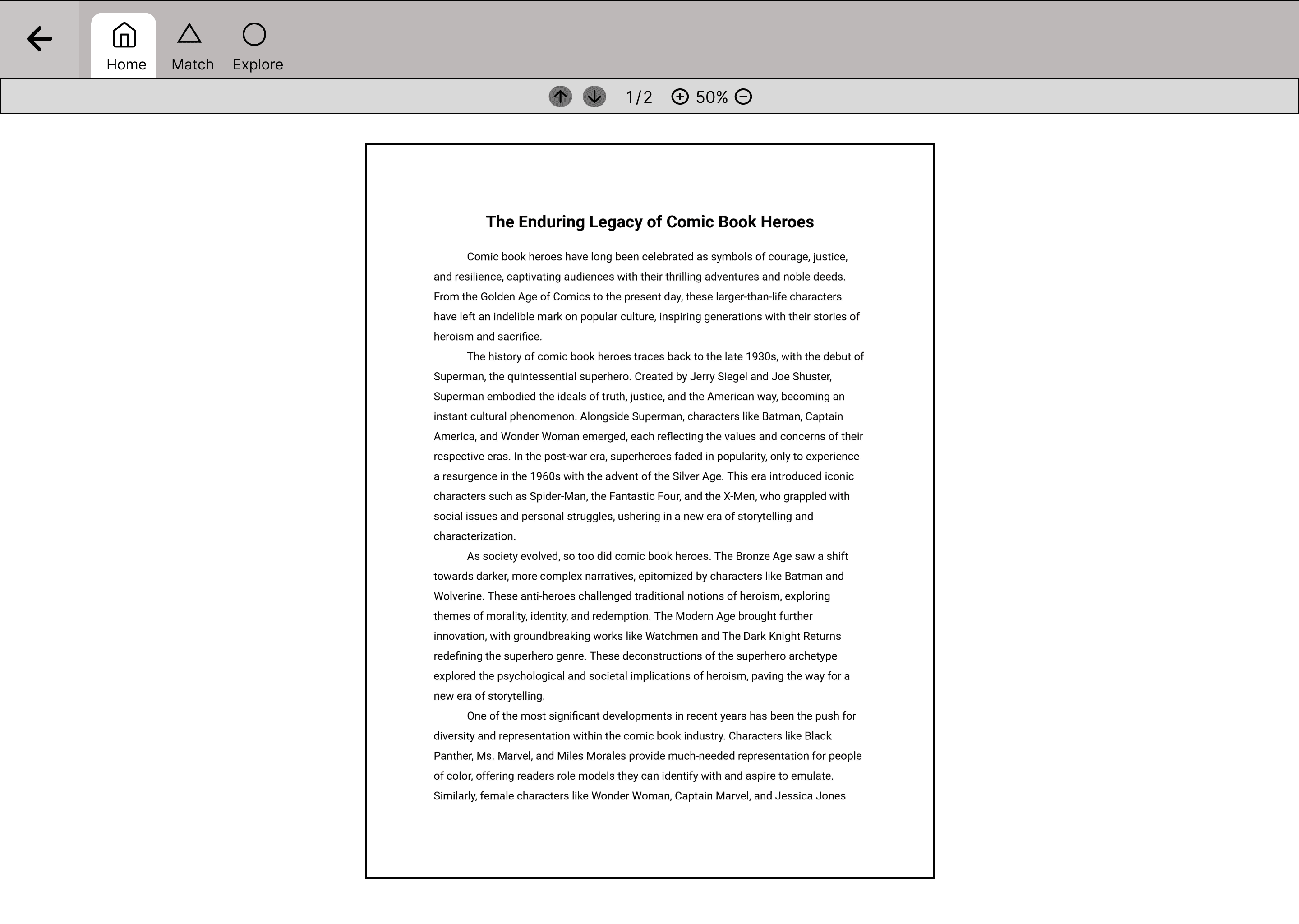
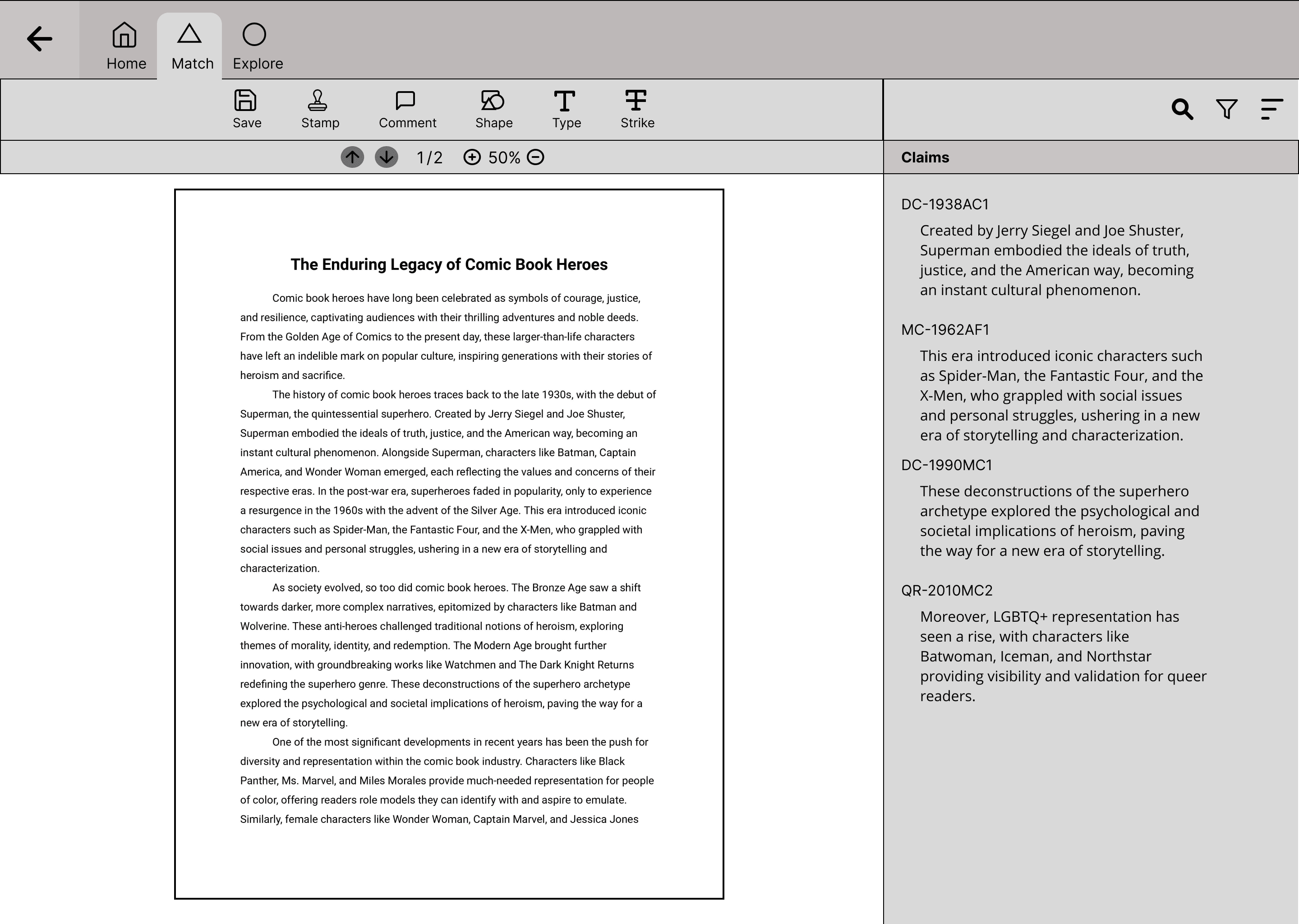
1- Return back to file directory
2- Tabs to switch between views and functions

3- List of matched results found by the AI that align with the internal database

1

3

2

Creating the Concept

Creating the Concept