Research and Discovery


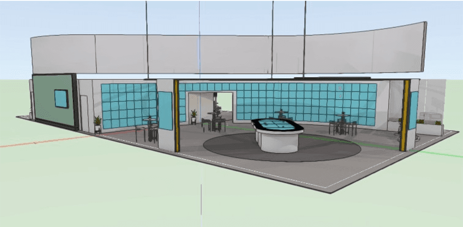
Final Design


Project status
The interactive tabletop experience was successfully completed and delivered to the client for implementation at the ADPD medical conference. I gained valuable insight into designing for both the digital and physical experience by learning to incorporate context into design choices made for the overall experience.
Next steps
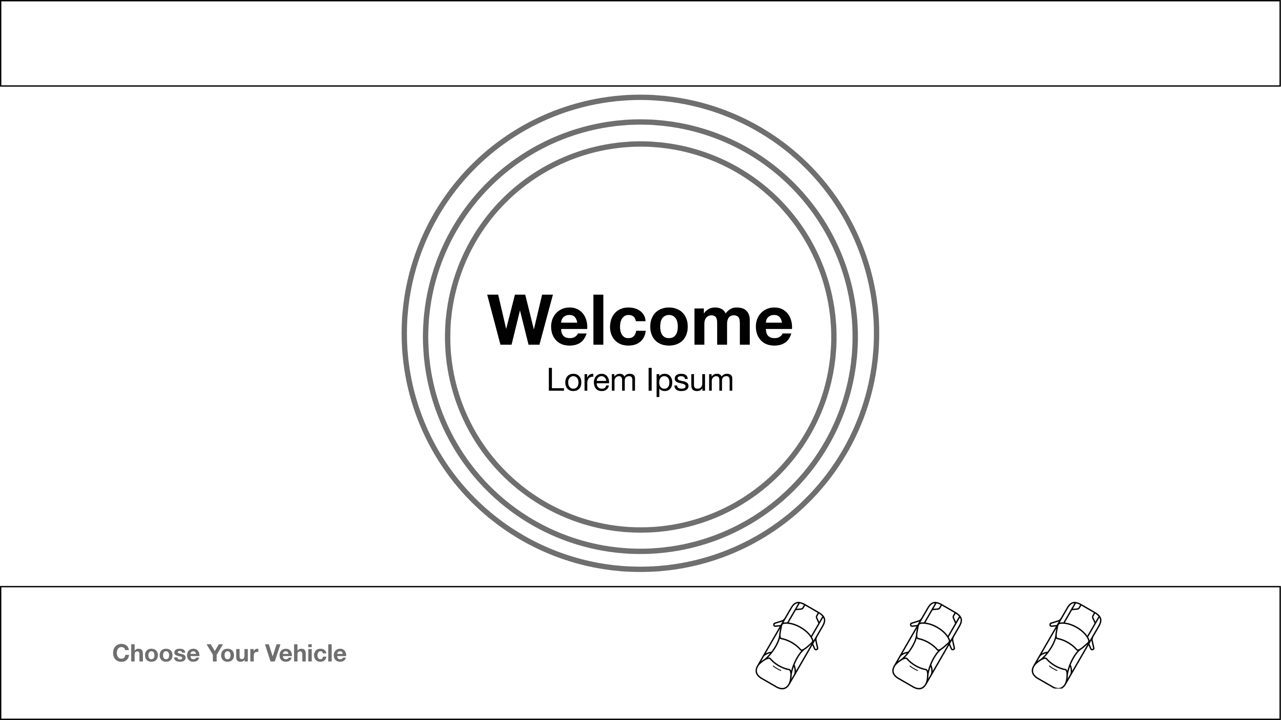
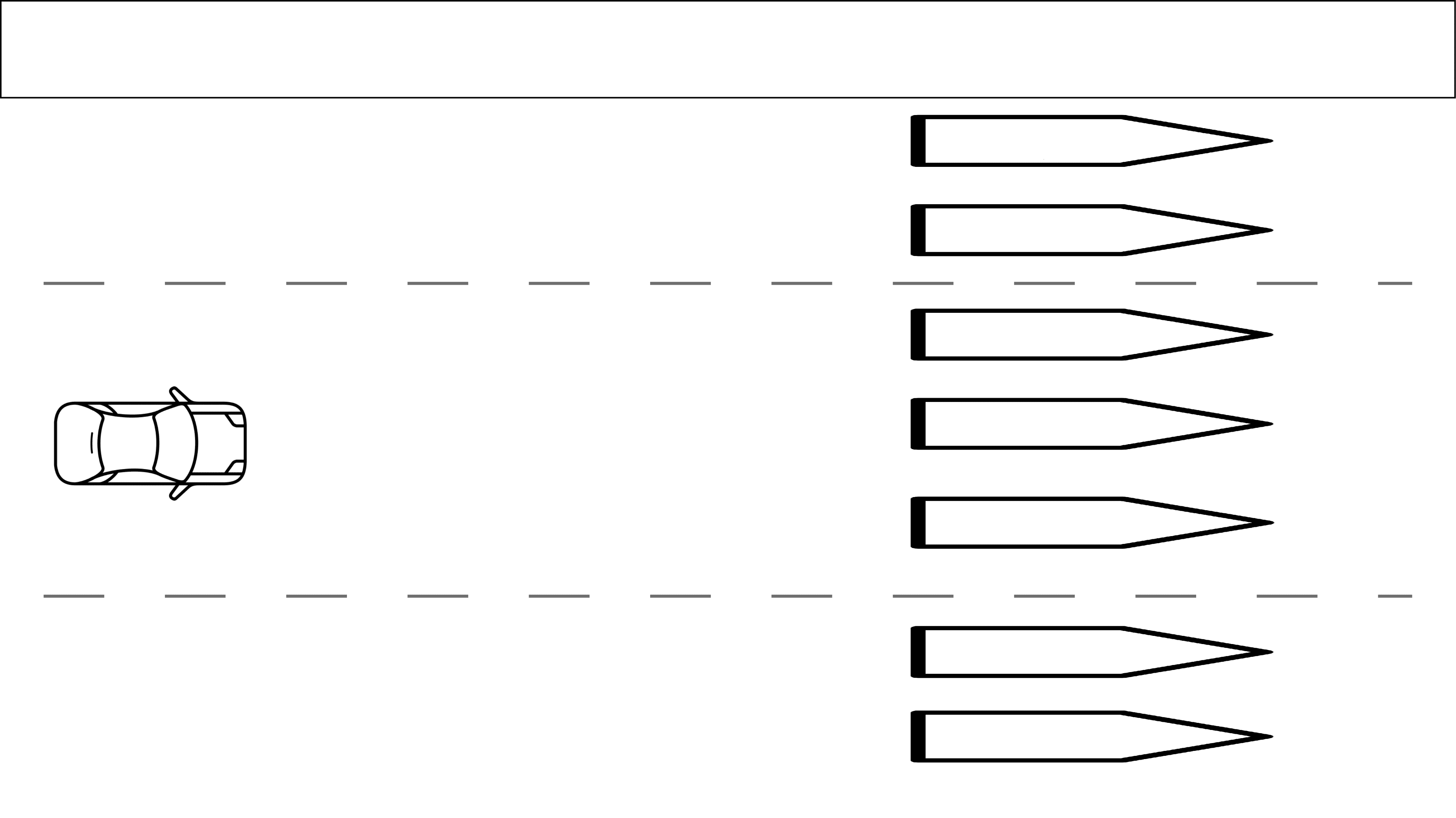
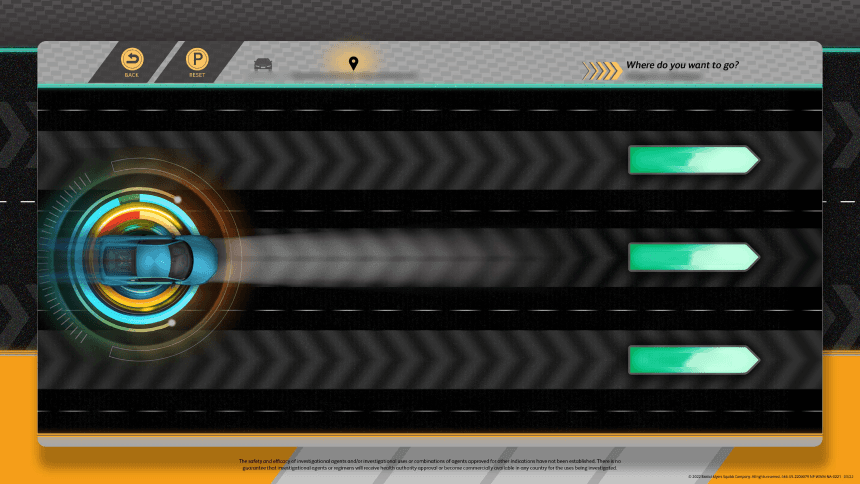
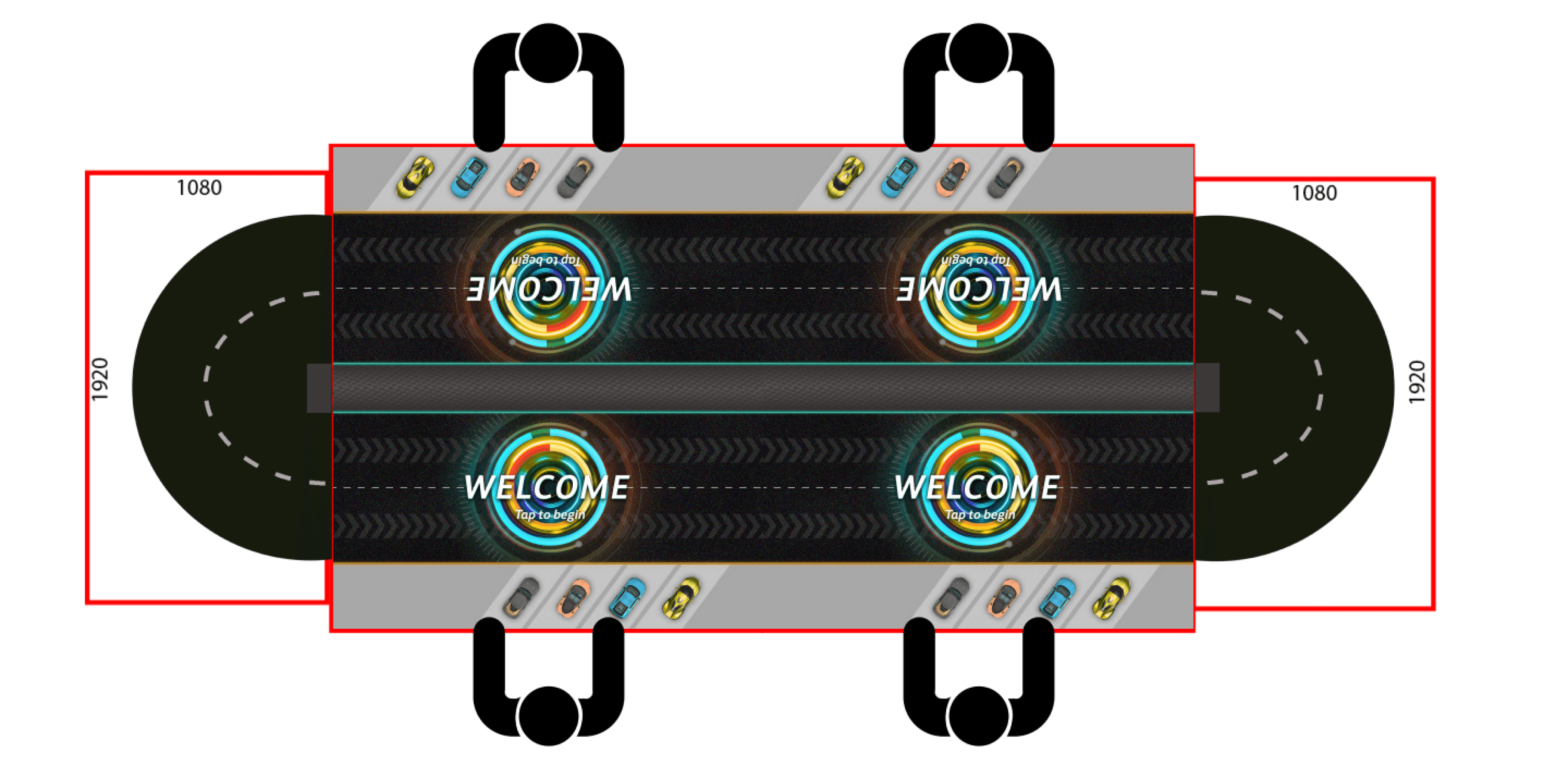
Refining UI elements The breadcrumb system needs to be updated to accurately reflect user progress. I also want to consider leveraging the car selection process as the primary interaction entry point. Each car would be a separate category that, when selected, would start the experience at what is currently the second step.
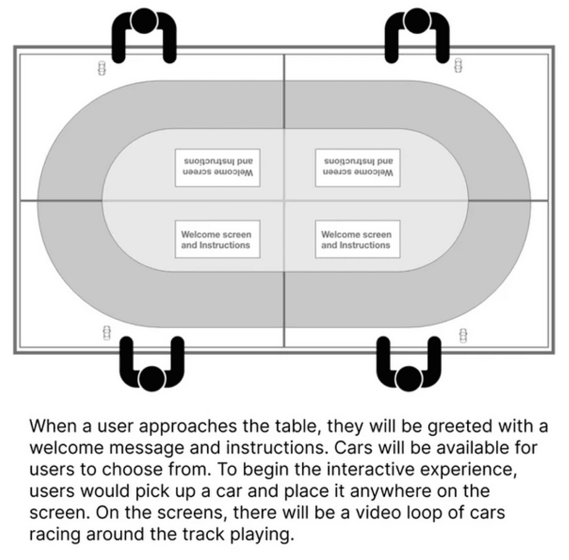
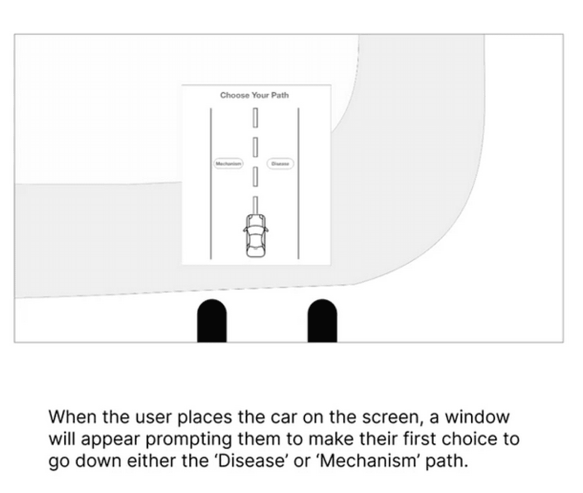
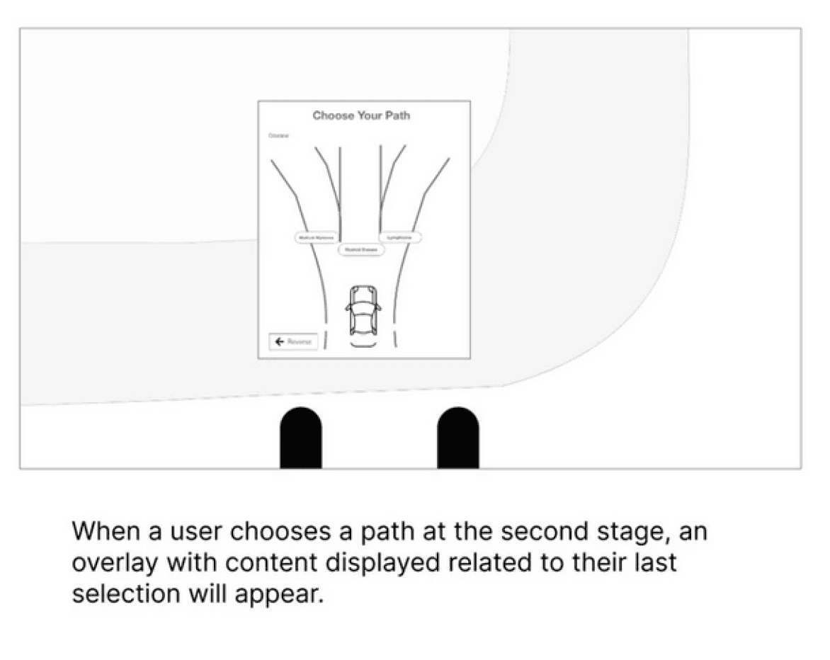
Design Process