
Project Summary
Led UX strategy for Amgen’s Otezla consumer website rebrand, collaborating with cross-functional teams to improve drug information accessibility and regulatory compliance. Redesigned information architecture to seamlessly connect three indication-focused sections while maintaining FDA requirements. Additionally, designed a streamlined enrollment flow for the Otezla SupportPlus program, creating tailored user journeys that direct prospective and current patients to relevant resources based on their specific needs and treatment stage.
Key Challenges » Multi-indication navigation, regulatory information accessibility, personalized patient support enrollment
Role » UX Designer collaborating with art directors, copywriters, account, and project managers
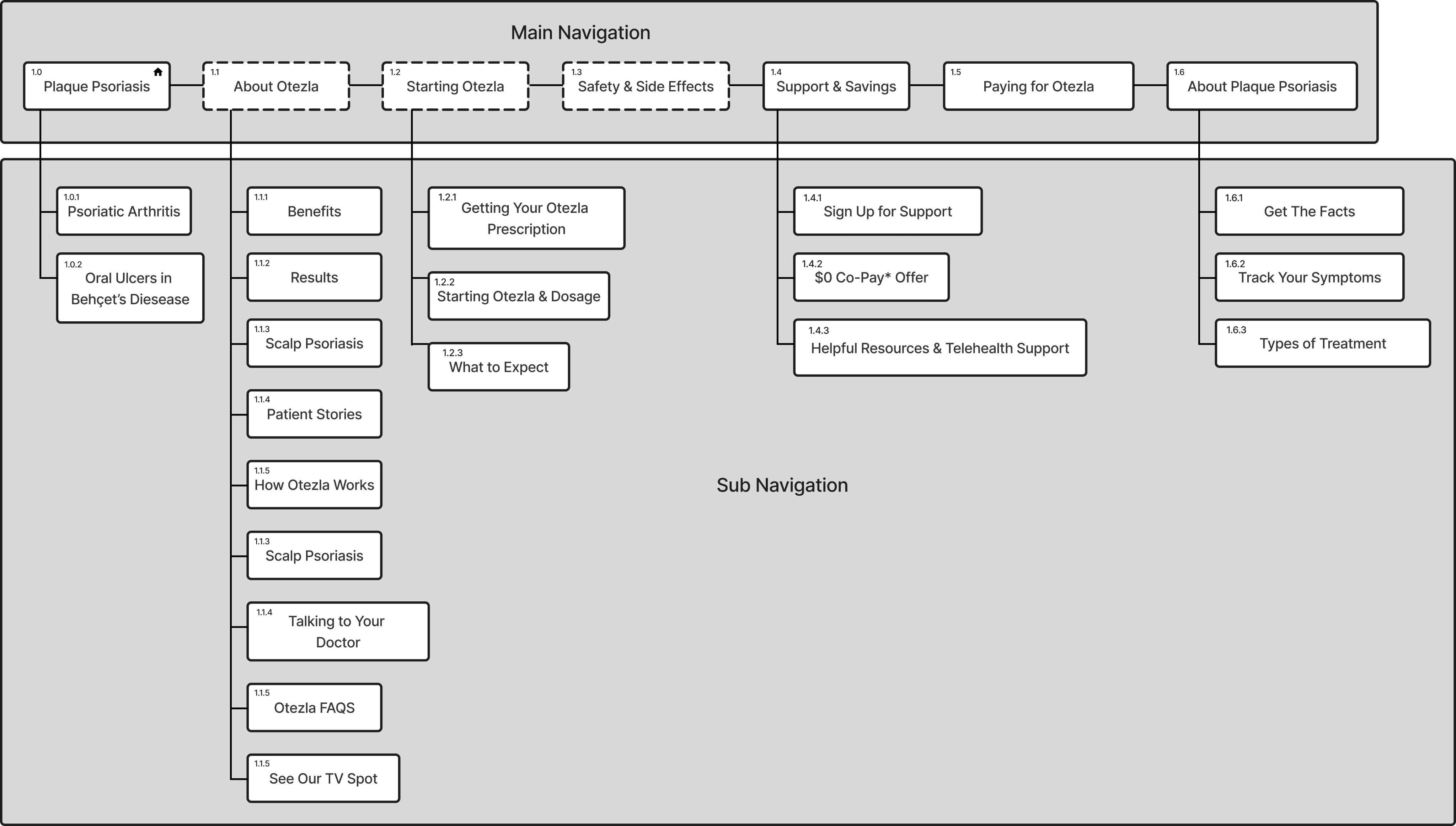
The first thing I did was explore the current website. After my initial audit of the site, I gathered more context from the rest of the team in order to make more informed suggestions for changes to the overall website structure. This insure that I aligned with both the client’s request for the website and the users’ needs. The main changes included:
• Creating direct routes to information by regrouping navigation items.
• Developing a main navigation structure that could be applied across the different parts of the site.
• Identifying which navigation items were global (not anchored to one section) and which were condition-specific

Enrollment Form
In addition to restructuring the main site navigation, I redesigned the enrollment flow for the SupportPlus program. The original form was lengthy and didn’t differentiate between prospective and current patients, creating confusion about relevant resources. Changes included:
• Breaking the form up into digestible sections, removing the need for a long scroll.
• Adding a progress bar to ground users and keep them informed on their progress.
• Creating an early decision point in the form process to filter users to their appropriate groups
Previous form Experience


Project Takeaway
The most important takeaway from this project was learning to advocate more strongly for user-centered design decisions. Coming from a background of working independently as a freelancer, I initially held back on providing feedback during collaboration, thinking this would help maintain team harmony by avoiding stepping on anyone’s toes. However, I learned that staying silent doesn’t protect the user experience or project outcomes. Even when external factors impact a project’s direction, it’s crucial to voice concerns about design decisions that could negatively affect users. Moving forward, I understand it’s more valuable to speak up for what serves users best, regardless of potential pushback or project constraints.
